Monday, 18 February 2013

STUDY TASK 6 - WHAT IS DESIGN PRACTICE?

tartFragment-->“[Graphic Design is] An ongoing examination/conversation between the dynamics of
personal exploration and professional practice”
– Matt Owens, Volumeone.


There are three ways in which we can start to think about design practice.


  • Appropriateness of response (appropriate to brief/target audience)
  • Quality of resolution (Aesthetically engaging)
  • Meeting the deadline (Produced in time to meet the deadline)


When thinking about our own personal design practice we need to consider what it is we want to do as designers, and what we need to do. Our own personal taste and preferences affect this.


Moreover, our rationale is affected by our own preferences, what we want to do/design and why and the reasoning behind our design choices. 

As designers our work can be affected by how we approach our design process. Our approach to a project can usually be defined by three different design approaches that are as followed;

Concept driven
Ideas driven
Research driven

Different briefs require different approaches, such as if you are designing for a specific audience, context or media.

Other things that can affect our rationale is our priorities as a designer, such as if the design and creative aspect of a design is everything. Moreover, ethical priorities can also affect the clients we work for, such as some designers would not design for large corporations and businesses whereas others only design for commercial purposes. 

There are complex relationships between the topics and finding were you sit within them is vital to your personal design practice.

Moreover, our rational is also affected by how we work, such as if our work is; 

  • Handmade
  • Digital
  • Lens based

Or the dimensions of the outcome;

  • 2 Dimensional (paper)
  • 3 Dimensional (Object - packaging)\
  • 4 Dimensional (Movement/Time - Sequence of posters)

We can improve the quality of our resolutions by carrying out on going evaluations of our outcomes. The quality of a resolution can be affected by numerous factors;


  • Depth of appropriate research
  • Breadth of initial ideas
  • Selection of potential solutions
  • Thorough visual development
  • Attention to detail / Crafting
  • Clarity of presentation

Additionally, considerations need to be thought about with regards to the useage of type and image to communicate a message, and the usage of media. Does the media used conflict or support the message.  


TASK

Near to the end of the session we were given a sheet of 10 questions to complete, these were relevant to the topics discussed in lesson and required us to list things such as our 5 strongest design skills. 


After writing our personal responses to each task we were divided up into small groups were we then presented our information. I was put into a group with Adam and Alex, as each person presented their information we took detailed notes, Fred then introduced us to the task.

ADAM


  1. Adam Garbutt
  2. Hand made, Digital, Illustrative, Solid colour, Concentration.
  3. On time for deadlines, Creative, Friendly, Open.
  4. Manipulation, Illustration, Typography, Hand made, Photography.
  5. Advertising, Motion Graphics, Flyers, Leaflets and hand-outs.
  6. Olly moss, David Shrigley, Saul Bass, Sagmeister & Walsh.
  7. Digitally Illustrative (simple yet effective communication), Simplification of ideas. 
  8. Pretty shitty, Computer Arts.
  9. Freelance/Independent work, Own Studio.
  10. Hard work, Commitment, Make industry connections.


ALEX

  1. Alex Dyson, Behance.com/AlexDyson
  2. Clean, Simple, Well Presented, Experimental, Modern.
  3. Hungry, Motivated, Sleepy, To the Point, Fun.
  4. Photoshop, Illustrator, Photography, Drawing, Curiosity.
  5. Branding and Identity, Information and way-finding, Album artwork, Posters.
  6. Drew Milward, Sagmiester and Walsh, Cube 3, We are Good.
  7. Wearecube3.com, Wearegood.com
  8. Computer arts, Creative Review, Design Inspiration, Design week, Identity Designed.
  9. Individual, Signature work, Experience, Designs.
  10. Efficient, Skilled, Experimental, Clever, Individual. 


We are required to design a free add that will communicate the design practice of myself and the two other members of my group. The add needs to reflect the design practice of each member, and will be presented at 


RESEARCH 

I started by collecting some visual research into some design free adds.


Simple effective add, the style it has been created in makes me think that the designers style will be hand rendered and illustrative. Additionally, the add is effective as its simple and uses an intense yellow background color that grabs the audiences attention. However, I think the add would benefit by having something to put it in context, as it is not mentioned that the add is advertising a designer.  


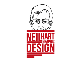
This add is a lot more appropriate as it gives the audience an introduction to the stye of the designer, and provides information regarding the designers name and how to contact him.


Finally, I looked at this design. As an advertisement it is effective, it clearly states the speciality and introduces us to the designers. However, if being produced to advertise the designer, contact i name information would need to be added.


The add needs to capture the individual tastes and style of each designer to accurately advertise them. Therefore, I research further into the information gathered from the questions, and support this further with information gathered from their personal blogs regarding artists and aesthetic preferences. 

ADAM


These three posters were created by Olly moss an illustrator mentioned as one of Adams favorite designers. The posters are designed in a very illustrative way relying on image to communicate the message. 


Additionally, Adam also listed David Shrigley as one of his favorite designers. Shrigley creates simple illustrations which often have a funny tone of voice. I could possibly create an illustration in a similar style for his add.


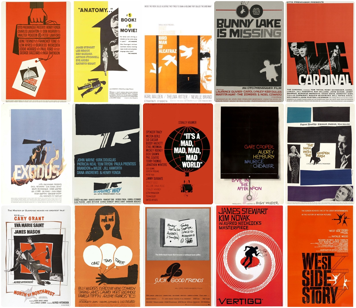
These designs were created by designer Saul Bass another one of Adams favorite designers, they all use a mix of type and illustration to communicate their message. 


Finally, I have used Adams favorite designers work to form my visual research. I plan to create a simple Saul Bass style illustration to support the information that will be communicated through typography.


ALEX


Image taken from Alex's behance page, its shows a selection of his past projects, looking at these will help me get an idea of style.

Illustrative logo created for Satans Hollow.


Illustrative logo created for a t-shirt design.


Moreover, you can also look at projects from professional designers that he has appreciated.


Joshua M Smith


Beatrice Mikulskyte


Next, I looked at a collection of work from his artists to get a further understanding of the work Alex likes. 


Illustrated screen-print poster created for a Ben Folds gig by Drew Millward.


Public Bike Poster

Public Bike Poster
Above is a piece by Sagmeister and Walsh, the poster is illustrative and uses a pattern of bike chain to form the posters content. A lot of work from Sagmeister and Walsh is clean, modern and focused.


Beer labels created by Wearegood.com, aesthetically effective as the labels are clean and used a limited amount of colour. 


I used a range of images collected from the inspiration given when Alex answered the set of questions, I will combine this with the other responses regarding how he works to help me create an add which accurately portrays him as a designer.


DESIGN SHEETS

Before I started designing the adds I made some design sheets to explore my ideas for each add.


FINALS


ADAM


ALEX


MINE


Friday, 15 February 2013

DESIGN IS ABOUT DOING - CRITICISM

Today, we had our group criticism, we were first split into small groups where we presented our design sheets and five visual variations. After we presented our ideas and explained how the project was progressing, we then discussed as a group how the outcome could be improved and made suggestions as to how this could be done. 

I presented my work first, showing my design sheets, then visual variations. My designs were well received, especially the 'Iwo Jima' design that I had previously digitally produced. I then received feedback from the group which is shown below. 


FEEDBACK

  • Explore my favourite visual variations digitally.

  • Produce a digital illustration of the Balaclava design.


  • In my portrait grid design I could consider creating a grid of coloured squares to go behind each of the vector portrits.


  • When creating the grid I could consider using the same color scheme that I used in my 'Iwo Jima' design. 

  • Everyone was really impressed with the digital mock-up of my 'Iwo Jima' design, but it was mentioned that some lines in the illustration could be tidied up and made more accurate.


PROGRESSION 


I will produce a digital version of the 'balaclava' design, as the composition and relevance of this design is stronger than the portrait grid. After reviewing the layout of the portrait grid I found a problem regarding the spacing between the illustrations. Therefore  I decided not to develop this design any further.

Monday, 28 January 2013

STUDY TASK 5 - WHERE AM I NOW?

10 things that you have learned about yourself as an individual and as learner.


  • The way I conduct my research has developed, I now collect research from a range of different sources, and understand the importance of primary and secondary research. I have made a template for a survey, so now every time I get a new brief I can quickly produce a survey to gather primary research. Gathering research from a wide range of sources enables me to get a better understanding of the topic and the audience associated. 


  • Taking detailed notes and then revising them when blogging helps me retain more information and get a greater understanding of the topic, such as in colour theory. When blogging what we had learnt in our design principles lesson my notes helped me remember key information, and formed the base for further research. 

  • By conducting on going, personal assessments I am able to further develop my work. Along with the crits and group assessments I have started conducting quick evaluations, that look at the functionality of work in regards to audience and theme. This helps me develop parts of my work to form a better outcome.


  • Working in groups has helped me develop my verbal communication skills. In the 'How to...' brief we worked in groups to produce an outcome. Due to conflicting ideas and tastes in design there were disagreements about certain design decisions. To overcome these we had to discuss the problems and conflicting ideas. I learned that in this sort of situation you have to be open minded to other peoples ideas, and work at combining the best aspects to form the outcome. I want to work in groups more often to help me develop my communication skill further, as in the professional work environment designers will often collaborate and work in groups when completing projects. 

  • Moreover, I have also learned the important of exploring different outcome variations in the design process. In recent projects I have been creating design sheets, with a title and blank templates. After scanning these in I printed numerous copies so I can quickly explore variations of my outcome. Working in this way has enabled me to explore all my ideas and develop specific aspects of my designs, resulting in a higher quality outcome.


  • Additionally, when evaluating past projects I mentioned that organizing my time more efficiently would help me  further develop my outcome. Therefore, in our last brief 'Research, Collect, Communicate - Product'   I created time management sheets. In these I listed tasks to complete each day, this helped me keep  my organised, and left me with more time to develop and print my design. There was a definite improvement, on a whole my project was more organised, and I had spare time at the end of the project to re-produce my outcome after there was problems with the stock it was initially printed on.


  • I believe that one of my weaknesses is writing. I spend a lot of time writing essays or text for projects as I struggle to form organised, flowing sentences. However, I have started creating plans to help me with the structure of what I am writing. When producing bulk text for my blog and projects I have started making organised notes of important points I want to cover, and other subject matter relevant to what I am writing about. Moreover, when writing my essay I created a detailed essay plan that listed points of importance, and organised the topics I wanted to cover. I will continue to create these plans as I have found it helps massively when writing.
  • Moreover, I have started immersing myself in the creative industry by  following blogs, studios, designers and illustrators. This helps me keep me up to date with the goings on in the industry and upcoming events. 


  • Moreover, another thing that I have learned about myself as a learner is the importance of keeping  'to-do lists' to keep myself organised. The course has various briefs running at the same time, meaning that there are various tasks for each brief that need completing. I find that it is easiest to write everything down on a to-do list and work my way through it, systematically crossing off each task. 

  • Finally, I have also learned that keeping on top of my blog is essential. The course requires us to blog constantly and in the first few weeks I didn't realise the importance of keeping my blog organised and up-to-date. Spending hours updating my blog made me realise the amount of time that should be spent blogging, I now blog on a daily basis to avoid falling behind again.


10 things that you have learned about yourself as a designer.


  • Recent projects such as 'Birth of a Font' and 'Alphabet Soup' have helped me get a greater understanding of typography and how it should be used. In the 'Birth of a Font' brief I enjoyed creating alphabets, as it made me think about the importance of having consistent elements running throughout a set of letters. Moreover, I have also started thinking about the relationship type has with its audience, and how this affects the choice of typeface when designing. I find a range of different styles of typography interesting, recently I have been looking at a lot of hand drawn typography and prints. Below are some examples of work that I find aesthetically engaging, the first is a print by graffiti artist 'Roids' and the second are typographic t-shirt designs by Alex Trochut. 


  • Moreover, creating a publication in the 'Research, Collect, Communicate - Product' brief helped me get a better understanding of layout within a publication. I experimented with mixing illustrations and typography to achieve a balanced page. I found that it was important to use limited visual elements and negative space to focus the audiences attention on the important information. Moreover, I also created a strong theme in the book by using consistent visual elements and shapes such as the circle, which reflected the space theme of the story. 


I enjoyed creating the publication and it has sparked my interest in publication and magazine design. Design firm 'National Forest' produce a range of printed publications which show a good use of layout and typography.


Moreover, I also find 'Huck' magazine really inspiring. They have strong consistent visual themes running throughout all there magazines and also experiment with page layout. Additionally,  the content of the magazine is also in my interest as they  feature articles on skateboarding and the lifestyle associated.


  • Additionally, for the 'Typogateaux' brief  I created some packaging for my cake.  The packaging served two main functions, to protect the cake and aesthetically engage the audience. After designing various outcomes I experimented with making various small scaled models which explored the functionality of each design. I found creating the packaging challenging as considerations had to be made regarding stock and production. After experimenting with producing packaging for my typogateaux  I want to further explore packaging design, and the different outcomes that can be produced, 'I Love Dust' is a design firm from London that specialize in packaging design among other things. I would love to work for a firm like this as their work is quite illustrative, and this is something that engages me as a designer.


1

2


  • I have produced packaging in three different briefs so far, the group 'How to..' brief, 'typogateaux' and the 'Xenu' brief. Before this I had relatively no experience with producing or designing packaging. However, completing all three briefs sparked my interest in packaging design. In my design process, I sketched out variations of possible net designs, from these I created an assortment of models. The models enabled me to test the functionality of each design, and asses which design is the strongest. After I discovered design mistakes when creating the models, I realized how important it is to use them in the design process. In future projects when creating packaging, I will always test the functionality of my design by creating a scale model of it.


  • Another thing that I have learned since starting the course is that I love producing printed outcomes. For me there is a certain quality achieved by printed outcomes that no other type of design outcome can match. Whether the product is digitally printed screen printed, the process of choosing the correct stock and printing the outcome holds massive interest to me as a designer. So far on the course I haven't screen printed, however this is something I hope to involve in future projects. Drew Millward is an illustrator from Leeds, I find his posters really inspirational as they show a good use of illustation and colour. Moreover, a lot of his work is screen printed and available for purchase.


  • The 'What is graphic design 1' task required us to collect examples of work that are interesting/inspiring. After reviewing the range of work I collected, I realised that the majority of the outcomes were illustrative, or had an illustrative influence. I know that graphic design pieces often use illustration as a way of aiding the communication of a piece. However, I am fascinated by illustration work by artists such as 'Drew Milward' 'Funeral French' and 'God machine' due to the style and detail that is achieved in each piece. Moreover, I believe another reason I like illustrators like the selection mentioned above could be because of their link to the skateboard industry that I grew up around.


  • Our most recent brief required us to create an outcome that communicated facts or data using infographics. We were briefly introduced to infographcis in the first 'How to...' brief we received in the first week of the course. However, in the 'Xenu' project my research into infographics was much more in-depth, enabling me to look at a range of different ways information can be displayed. I thoroughly enjoyed thinking about how I could present boring information in a visually engaging way, which is what sparked my interest in infographics. I have realised how useful they can be, as they are more engaging for an audience to view than blocks of text or data. The infographic below was created by 'Infogr8' a London based design company who specialise in visually presenting information and data. Their infographics use a mix of illustration and diagrams to visually communicate the inormation.


  • Moreover, in our most recent design principles sessions, we covered colour theory. We learned about Itten's colour wheel, and his seven colour contrasts. I had previously never learned anything about colour theory, so I was new to most of the information and rules Fred introduced us too. As I was interested in the topic, I retained a lot of the information taught in lesson. Despite this, I want to research further into colour theory as it is relevant to graphic design and can help improve my work.

  • Additionally, we have also recently completed software workshops, were we learned the basics of Adobe Photoshop, Illustrator and InDesign. The workshops worked as a quick introduction to each program. However, I already had past experience using the programs, so already knew quite a lot of what we got taught. Despite this, I still leaned a lot of new techniques, and ways of working that will make my life easier as a designer. It boosted my confidence knowing that I was on my way to knowing the programs well, but also reminded me of the substantial amount there is to learn. This has inspired me to complete online tutorials to help further improve my knowledge of the programs.


  • Finally, I have learned about the importance of advertising myself as a designer. Recent 'What is Graphic Design...' tasks have required me to research into a range of different designers and design agency's. I noticed that the best ones always had a range of really well presented portfolio websites, showcasing their strongest work. Therefore, I have stared creating my own accounts on websites such as 'Behance', 'Tumblr' and 'Cargo Collective'. Although I don't have much work I feel confident displaying on them, I have accounts set up and ready for when I produce work that is of a higher graphic standard.

Friday, 25 January 2013

PRODUCT - CRITICISM

This criticism was conducted differently to previous ones. Instead of reviewing each others work, we left it in studio 4 where Amber and Simon reviewed it. This enabled them to review how well our outcomes communicated their message free from our input. I received the following feedback.


  • Strong use of infographics, they are clear and communicate the information well.

  • I need to choose an appropriate stock, as the stock that is used caused the text to be illegible in places. 


 Actions

  • Re-produce publication and print onto an appropriate stock. 

Tuesday, 15 January 2013

RATIONALE - RESEARCH, COLLECT, COMMUNICATE


After presenting my ideas I received feedback from the group.

Feedback


  • I could possibly present the story of Xenu along side my infographics. So I would compose illustrations of Xenu along side the graphs and charts displaying information.
  • I need to think about who I would send my outcome too, and create an appropriate mailing list. Distributing my outcome to the general public would mean collecting a range of addresses. I could research into sending my outcome to a company that would then redistribute the book.
  • I also need to consider how the design of the books contents reflect the information being displayed.