Friday, 6 February 2015

DBA - DEVELOPMENT

Two days after we set the research task members of the group reconvened to present the additional city information that was collected as part of the task. 


Most members of the groups had collected similar information reviewing a broad range of city relevant information.

Some of the subject areas that were covered are listed below;
  • Historic events.
  • Historical/well known people & public figures.
  • Predominant Architecture.
  • Natural features - rivers, surrounding countryside. 
  • City relevant coat of arms - symbolic representation.
  • City facts and figures.
  • Industry statistics.
  • Business opportunities. 

After discussing the information that was collected as part of the research task we progressed with the project by discussing the concept and how the cities could be represented under one cohesive identity, something that we began to understand is very challenging. 

During this discussion we also aimed to define a set of brand values which will be used to influence the focus and development of our campaign.

Notes taken during the discussions are listed below;

IMPORTANT ASPECTS - 
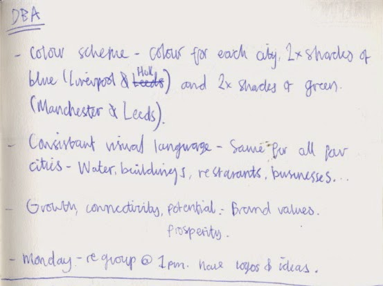
  • Colour scheme could consist of two main colours with shades representing the individual cities.
  • Two shades of blue could be used for Liverpool and Hull and they are both port cities and two shades of green could be used for the inland cities, Manchester & Leeds.
  • A consistent visual language should be developed for all four cities, this would include semiotic representations for businesses, restaurants, banks and cycleways etc.
  • The brand values should be geared towards industry but also have relevance to the other segments of the target audience; residents and tourists. 
  • BRAND VALUES - Growth, Potential and Connectivity. 


The group spent around half an hour discussing the possible directions the brief could be taken in, after which we gave ourselves an hours timeframe to start developing some initial logo ideas.

To build upon the brand values of Growth, Potential and Connectivity, I wanted to create a modular logo system that interconnects and grows while visually representing the individual cities and 'Capital North' campaign. To do this, I hoped to create a series of icons relevant to the four cities that can be connected and arranged in multiple ways, growing as more icons are added.

Using the information that was presented earlier in our session, I made four small icon illustrations depicting the symbolic representation of each city. The four outcomes formed a base from which I started developing a range of potential logo variations. 


After the developmental hour was up the group assembled around one of the tables for a critique of the responses created. Each person had around five minutes to present their ideas and concepts at the end of which, feedback and ideas were given. 

There was a range of ideas created during the hour, each of which was original and completely different from one another. A lot of the concepts, although aesthetically different, aimed to communicate the brand values while simultaneously representing the campaign. 

Unable to get a clear idea of which concept to progress with we ended the session by setting a weekend task to further develop the concepts presented within the critique. 


PROGRESSION 

To progress from the session a small weekend task was set in which members of the group were asked to continue developing their personal concepts and ideas which will be presented and refined during a big critique on Tuesday. 

Thursday, 5 February 2015

PPP3 - INSPIRATION


Today, I read a fascinating and inspirational article about the people of Sarayaku, an Amazonian tribe who are currently fighting back against the oil industry and effects of global warming.


The article discusses Patricia Gualinga's involved with campaigning for global action to stop climate change and the struggle faced by her tribe to stop the exploitation of their land for profit. Sarayaku is based in southern Ecuador, a country which has been the focus of much media attention for selling teh drilling rights to huge amounts of indigenous land. 

An aspect of the article I found really interesting was the section which discussed how the amazonian community are not only defending their land from the powerful corporate influences interested in exploiting it, but believe their balanced, nature focused lifestyle is key to overcoming the environmental and societal problems currently faced by 21st century society.
'What I found in Sarayaku was not just a community defending its territory. I encountered a people who believe that their lifestyle, deeply connected to nature, holds promise for humans to save themselves from global warming and extinction. They are fighting back by advancing a counter-capitalist vision called sumak kawsay—Kichwa for “living well”—living in harmony with the natural world and insisting that nature has rights deserving of protection.'
Additionally, another quote that really struck a resonance with my environmental philosophies discussed some of the choices people will have to make if we are to progress towards a sustainable future.


“choosing our responsibility to the seventh generation over quarterly earnings, regeneration over economic growth, and the pursuit of well-being and harmony over wealth and financial success.”


Wednesday, 4 February 2015

DBA - RESEARCH TASK

After dissecting the initial brief and collecting some quick preliminary data the group decided to split for the rest of the day to engage with additional individual research. The plan is to reconvene before the briefing tomorrow to present focused research into each of the four cities, hopefully establishing a platform of knowledge we can then start to develop concepts from. 

Before going our separate ways we divided up the workload to ensure that research was evenly split between the five members of the group. As to make thing less complicated, each member of the group was assigned the same city that was initially researched into during 


LEEDS SYMBOLS & EMBLEMS 

COAT OF ARMS 


leedscoatarmsclear.jpg


RELEVANT INFORMATION - 
  • The Leeds coat-of-arms developed over a period of time.
  • The owls came from the coat-of-arms belonging to Sir John Savile the first Alderman of Leeds.
  • The Savile family originally came from Anjou in northern France. They were given the right to vast areas of Yorkshire as a gift from William the Conqueror after the family kindly supported the battle of 1066.


LEEDS - OWL SYMBOLISM 


YORKSHIRE WHITE ROSE 


RELEVANT INFORMATION - 
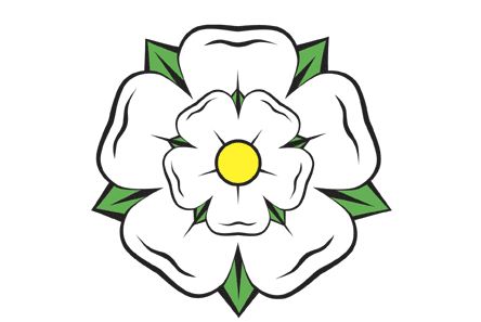
  • The White Rose of York is a white heraldic rose, is the symbol of the House of York and has since been adopted as a symbol of Yorkshire as a whole.
  • Traditionally the origins of the emblem are said to go back to Edmund of Langley in the fourteenth century, the first Duke of York.
  • During the civil wars of the fifteenth century, the White Rose was the symbol of Yorkist forces opposed to the rival House of Lancaster.
  • The red rose of Lancaster would be a later invention used to represent the House of Lancaster.
  • The opposition of the two roses gave the wars their name: the Wars of the Roses.


ARCHITECTURE 


LEEDS TOWN HALL 


LEEDS CITY COUNCIL


CORN EXCHANGE 


LEEDS CITY MARKET 


KIRKSTALL ABBEY 


LEEDS UNIVERSITY BUILDING 1 


LEEDS UNIVERSITY BUILDING 2


LEEDS BECKETT UNIVERSITY BUILDING  


DRY DOCK


JOSEPH PRIESTLY 

10 Reasons Leeds is Better Than Manchester - Joseph-Priestley-668-web

RELEVANT INFORMATION - 


  • Joseph Priestly was an 18th-century English theologian, Dissenting clergyman, natural philosopher, chemist, educator, and Liberal political theorist who published over 150 works.
  • Priestly was credited with the discovery of oxygen, having isolated it in its gaseous state. 
  • Priestly was from leeds.

PPP3 - SUSTAINABILITY SOCIETY MEETING

Today I attended one of the first meetings for the society of sustainability, a group that has recently been set up within the college to raise awareness of issues surrounding sustainability. 

The meeting was designed as a way to inform students interested in getting involved with the society about the current ideas, future ambitions and current progression with schemes that were put forwards in the first meeting. As a graphic designer whose practice is heavily influenced by the concept of sustainability involvement in the society has relevance to both my personal interests and professional practice. Furthermore, by becoming involved in the society I will naturally start networking with students outside of graphic design who share similar interests as myself.  

Notes that were taken during the session are displayed below;


IMPORTANT POINTS - 
  • Infographics made from recycled materials depicting information about sustainability will be produced, photographed and from an exhibition.
  • Recycled infographic sessions will take place - 17, 18, 19 March.
  • Recycle boxes will be placed around college for students to place spare or waste material into. 
  • Posters need making for the society - One to raise awareness and one for the spare material recycle boxes.
  • The next meeting is in two weeks time. 
  • Facebook group has been made - post any ideas here.


Tuesday, 3 February 2015

DBA - INITIAL IDEAS

After the preliminary briefing with the designers from DBA had concluded the first task that needed completing before progressing with the project was selecting a group of people to work with. 

Initially, just after the briefing had finished I was approached by Sean asking if I wanted to start a group with him. After agreeing we went round the class asking additional people if they wanted to join us.


THE TEAM 
  • Me
  • Sean.
  • James.
  • Jamie.
  • Jane.


ANALYSING THE BRIEF 

Despite having gone through the brief with the DBM members, we decided that it would be beneficial to read back over the information, a task which had two main benefits. Firstly, reading back through the brief allowed us to review the information again and remind ourselves of the specific aspects of the project. Secondly, while reading back through the content, we were able to outline, highlight and analyse definitive aspects of the brief, a process which is essential to creating an informed, original outcome.  


IMPORTANT POINTS - 
  • The 'HS3' high speed railway will connect four main norther cities to London - Visuals could be built around this and the idea of connection/unity.
  • Outcome need to communicate to a global audience - Communication need to be simple and effective.
  • City attributes - Access to human capital, great jobs & businesses, effective transport, strong universities, schools, colleges and hospitals, entertainment, green spaces, range of housing and accommodation and vibrant culture. 
  • The interconnectivity shared between the four cities should be a main focus of the campaign. 
  • Potential, Growth, Opportunity - Brand Values. 
  • Liverpool, Manchester, Leeds & Hull - Featured cities.
  • Capital North - Brand name.
  • Focus of the project should be on the quality and effectiveness of the visuals.
  • Avoid cliches & stereotypes.
  • Reasons for audience to visit listed cities - Business, Invest, Visit. 
  • What the are looking for - Quality thinking & Well executed visuals.  


RESEARCH EXERCISE  

After going through the brief we decided to progress with the project by collecting some quick secondary research to help create a base knowledge of the cities listed in the brief. 

After each group member had been assigned a city we gave ourselves 20 minutes to collect a body of research into the three reasons people would want to engage with the campaign, to do business, to visit or to Invest. Not only did the quick exercise broaden our knowledge of the feature cities, it also allowed us to assess if there are any common factors shared between the cities that could subsequently help to form an initial concept.

I researched into the city of Leeds. Information gathered from the exercise is displayed below. 


ANALYSIS 

After the 20 minutes were up each member of the group talked through the information they had found. During this process, we discussed similarities and aspects that could potentially featured in the campaign. 

RELEVANT ASPECTS - 
  • Manufacturing is huge up north, Leeds and Manchester have some of the largest employment bases of anywhere in the UK.
  • Global brands and start-up companies boast huge successes in the north.
  • The north boasts some of the most cost effective commercial property of all the UK regions.
  • Operating costs are 28% lower in norther regions.
  • There are a range of reasons to visit the northern cities, from tourist attractions like museums and galleries to beautiful countryside destinations like the Yorkshire dales.


During the discussions I took down notes as I found multiple ideas and directions were inspired as the information that was presented.  

Notes are displayed below; 


RELEVANT ASPECTS - 
  • Focuses of campaign - Culture, Arts, Dining, Entertainment, Education, Shopping & Business. 
  • A visual language of semiotic symbols could be created for the four cities. Symbols would have relevant to definitive aspects of each city.
  • A visual language would surpass the communication barrier encountered when addressing a global audience. 
  • The visual language could be used to create a logo/logos.
  • The audience could be focused into three main categories defined by the reason people visit cities -  Residents, Tourists, Industry.


PROGRESSION 

After completing the various exercises and discussing their outcomes we decided as a group that although there are some rough ideas emerging it would be beneficial to collect further, focused research before starting to develop a concept for the project. 

Each member of the group was assigned the same city they researched into during the initial task, with the undertaking of collecting an additional body of secondary research. 


Monday, 2 February 2015

DBA - PRELIMINARY BRIEFING

Today we had a briefing with a number of reputable designers from the 'Design Business Association' or 'DBA', a trade based organisation that looks to build bridges between businesses and designers within the UK.

In the briefing they introduced us to a live brief that we will be completing throughout the next month. 

Notes from the preliminary session are listed below; 


IMPORTANT POINTS - 
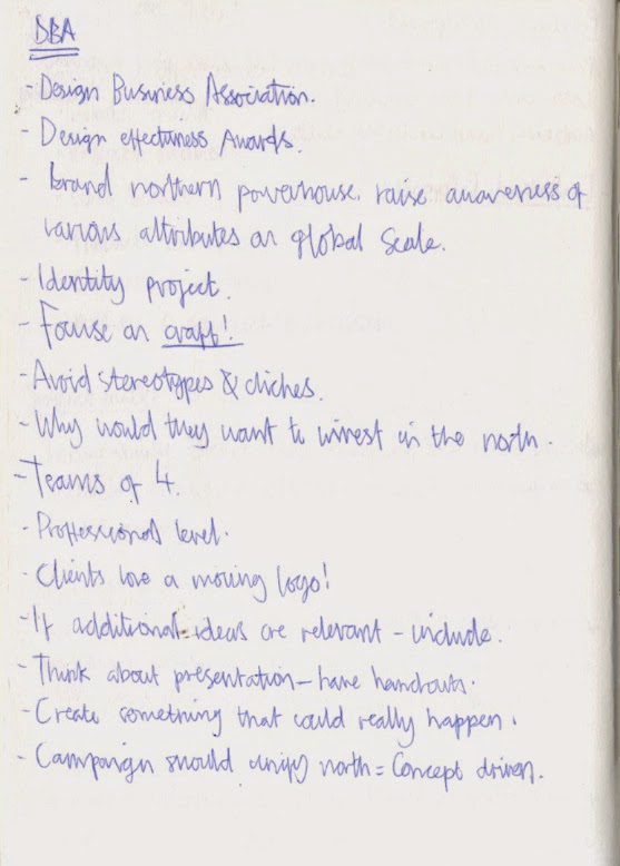
  • Identity project - Focus should be on creating a cohesive identity for the specified client.
  • Craft - A definitive factor of the project is the crafting and visual quality of work produced.
  • Avoid stereotypes and cliches when creating concept - Work should be professional.
  • Project needs to be completed in teams of four.
  • Be realistic - The campaign should be applicable in a real life environment.


Sunday, 1 February 2015

PPP3 - INSPIRATION

Today, while browsing through some design blogs I came across a post discussing a revolutionary new technology that has the potential to seriously impact the design industry and consequently open up a whole new world of opportunities. 


ROHINNI LIGHT PAPER 

The product, which has been created and produced by a company called Rohinni, allows you to PRINT LIGHT onto a thin, flexible paper like material. 


The innovative technology is manufactured by mixing ink with minute LED's that are around the size of a red blood cell. The substance is then printed onto a thin layer of conductive material which is then sandwiched between two additional layers and sealed closed. When an electrical current is applied to the material, the conductive layer disperses a charge across its surface consequently lighting up all of the little LED's creating a paper thin, light emitting material. 

The flexibility of the technology allows users to print light in any shape and also gives users the ability to apply the light paper to nearly any surface. In reality, the applications of such a technology are endless, and it is not until lightpaper can be exploited by creatives that its full potential will be realised.

At this current moment in time, the creators of lightpaper are still not sure exactly how it will be used. However, the company has established that it is not interested in breaking into the already entrenched TV market, but would rather apply the technology in industries where it can immediately have an impact.

Consumers should start to see lightpaper on the commercial market in 2015, however it wont be available to smaller consumers until the company gets a footing in the market.