Thursday, 12 February 2015
PPP3 - NOTEBOOK PHOTOGRAPHY
After I had completed the long process of physically producing the individual notebooks I progressed with the project by organising a promotional photo shoot with a photography
student.
Currently, I am very busy with other ongoing projects for the Extended Practice and PPP modules. Therefore, organising the shoot with a student from third year photography allowed me to personally save time and resulted in a set of professional promotional images for the series of sustainable notebooks.
I have listed some of the benefits of taking promotional images below;
- Used to raise awareness of booklets which consequently helps with their sale.
- Allows me to use the project as an original portfolio piece.
DBA - PROGRESS CRITICISM
In todays session we had a critique with the DBA members in which they reviewed our current progress with the brief they set last week.
In preparation for the session, Sean made a quick presentation displaying the range of logos that have been developed so far, allowing us to have visual examples of our work while talking about our brand values.
The image below displays the boards that were displayed;
Each member of the group had a chance to talk through their current ideas before the DBA team gave feedback on our current progression.
FEEDBACK -
- Such a good range of ideas makes it hard to choose a direction to progress in.
- Our brand values aren't 'Brand Values' they are more like brand attributes.
- North star icon (developed by James) has a lot of potential and is a good representation for the campaign.
- Modular logo is relevant and has a good application.
- Consider creating a range of logos that combine the strongest aspects of the current logos.
- Logo needs to be more than a logo, it should tesselate and have a range of applications spanning the identity.
COMBINING LOGOS
After some useful feedback from the DBA guys we decided to have a repeat of the one hour task we engaged with last week, only this time the hour would be spent developing logo concepts that combined the strongest elements of different logos.
Using James' geometric north star design I started experimenting with different concepts by extending the lines to form interesting patterns into which the icons could be placed.
I continued to experiment with this concept but decided as a logo it is far too intricate to work as a final design. However, the idea illustrates how James' star could be adapted to form aspects of a larger identity.
Finally, progressing from the complexity of the previous designs I simplified the concept refining the design to an arrangement of squares.
CONCLUSION
After the hour was over we had the chance to present the combination logos to one of the members of the DBA team, allowing him to assess the developments and give feedback as to how we could potentially progress.
FEEDBACK -
- All of the combination logos show potential.
- James' simplified north star logo with the negative space 'N' is really strong and should be developed.
- Continue with the process of refining and development.
PROGRESSION
Progressing from the feedback, we decided to progress with James' simplified north start logo, sending the file to each member of the group so a range of logo variations can be developed individually. As we finished the session we organised to have another group meeting on Friday in which we will display the variations of the star logo, hopefully allowing us to define a final outcome.
Tuesday, 10 February 2015
DBA - LOGO CRITIQUE
Today we had the first progress critique after the group split up for the weekend to develop logo concepts. At this point in the project, we currently have an established set of band values and a range of supporting concepts and logo ideas. To progress from this stage of the project, we aimed to outline a final logo design by the end of the criticism, giving us a solid foundation of work to show the members of DBM in their session tomorrow.
As discussed in the previous post, I created a modular logo made from squares that can be built up and arranged in different ways. Examples of the logos I presented to the group can be seen below.
CRITIQUE
Following the same format as the rest of the criticisms and presentations my group has organised with we gave each team member around five minutes to present and talk through their logo concepts. After the process, members of the group gave feedback on the aspects we thought worked well and how we could potentially progress from this point.
During the critique I took notes of any important or relevant information that was discussed. Notes from the session can be seen below;
MEETING NOTES -
IMPORTANT POINTS -
- Colour scheme needs developing - four colours for four cities.
- Continue to develop modular logo with additional icons.
- Develop a tagline for the campaign.
CONCLUSION
Todays session was useful as it allowed us to assess the refined versions of everybody's logo concepts and review the variety of potential directions the brief could be taken in. However, due to the fact that each group member has produced a range of quality outcomes with relevant concepts supporting them made it very hard to meet the original aim of the session which was to choose a final design.
After much debate we decided to finish the criticism and wait till tomorrow to get a professional opinion on the situation from the DBA members. With a fresh set of eyes and a wealth of knowledge we are hoping that they can provide us with some valuable insights. consequently helping us to outline a final logo design.
Sunday, 8 February 2015
DBA - WEEKEND TASK
At the end of the previous session we decided to set a weekend task which entailed developing the logo concepts that were presented to the group on Friday. During the presentation process, members of the group who weren't presenting offered feedback and helped to outlined the strongest designs.
Following the critique process, the weekend task challenged group members with continuing the logo development process, exclusively working on the most successful design as outlined by the group.
Prior to the task, I had focused my time on developing a system of logos that can be built up and arranged in different ways, the concept behind which aimed to encapsulate the brand values of growth and connectivity. During the criticism, members of the group were very positive about the idea however, due to the time frame in which the logo system was developed in the design was fairly messy. Therefore, I spent a few hours over the weekend redesigning the icons and developing the concept to a higher standard.
Following the critique process, the weekend task challenged group members with continuing the logo development process, exclusively working on the most successful design as outlined by the group.
![]() |
| These logo variations were outlined as the strongest variations. |
Prior to the task, I had focused my time on developing a system of logos that can be built up and arranged in different ways, the concept behind which aimed to encapsulate the brand values of growth and connectivity. During the criticism, members of the group were very positive about the idea however, due to the time frame in which the logo system was developed in the design was fairly messy. Therefore, I spent a few hours over the weekend redesigning the icons and developing the concept to a higher standard.
ICONS
The design process was started by redesigning the set of icons developed for the previous criticism.

The design process was started by redesigning the set of icons developed for the previous criticism.

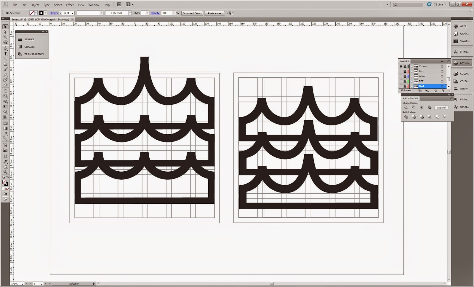
The new set of icons were created using a small 6x6 grid to ensure the set of illustrations are cohesive and can potentially be overlaid and/or overlapped.
Icons were created with thick bold lines to ensure that they are striking and will stand out when used at a range of sizes. The reason that there are two variations of the same icon is because the design on the left is the lined version and the design on the right has been expanded and refined.
Initially, using the quick icons I created in the initial hour long logo task i decided to use waves to represent Hull. However, I soon realised that waves are not the standardised representation of the city and so later updated the icon.
LOGO DEVELOPMENT
After creating the set of four icons I started developing a range of logo variations.
One technique I have tried to develop this year is the rate at which I can produce work, aiming to increase the speed in which I produce variations to increase my productivity and ability to progress through projects. As part of the PPP module I watched a video with renowned logo designer Aaron Draplin, in which he is challenged with creating a logo in 15minutes. Taking inspiration from this video I have started applying the techniques he uses, such as learning and using the various Adobe short cuts and creating variations with small changes.
I feel by applying the techniques learned from Aaron's video, I have been able to increace my productivity and ability to produce work in short amounts of time, undoubtedly benefitting my design practice.
After a while of playing around with various logo ideas I finally came to a concept I could identify as having a potential application within the project due to its relevance to the brand values outlined at the start of the project.
The concept is based upon placing the icons within squares that can be built up and arranged in different ways, visually portraying the brand values of connectivity and growth while simultaneously forming a representation of the four individual cities.
After further development I decided to have the 'Capital North' rectangles in a fixed position, meaning that the modular icons would have the ability to be rearranged and built up but the 'Capital North' typography would never move giving the logo a fixed and constant aspect.
The image below displays the concept I will display to the group, in which I have tried to replicate the geographical location of each city.
Friday, 6 February 2015
PPP3 - SOMETHING MORE PLACEMENT
Today we had a morning briefing with the team behind Something More design studio, in which they revealed the overall winner of the 'The Ministry of Wonderful' in college live brief that was set earlier in the year.
To my surprise, I was named as the overall winner of the brief and consequently was awarded with the wonderful scepter and sash displayed below. Furthermore, additional to the beauty queen style merchandise, I was also awarded with a two week work placement at the Something More studios.
PLACEMENT
As part of being named as the overall winner of the brief I have been awarded with a two week work placement which will take place at the Something More design studio after the Easter break.
The opportunity allows me to engage with my first work placement within the graphic design industry, the benefits of which I have listed below.
BENEFITS -
- First placement experience!
- Get an understanding of how a design studio functions, how work is split, the structure of a normal day, the intensity of the workload etc.
- The small size of the team will allow me to experience what it is like to work with a small team of dedicated designers,
- The placement gives me the opportunity to work along side designers with huge amounts of industry experience - leaning opportunities.
- Experience first hand what it is like to work in a commercially focused design studio - practical experience.
- Will help to raise my awareness of current developments in the commercial design sector.
Subscribe to:
Posts (Atom)