Wednesday, 19 November 2014

PPP3 - START UP WEDNESDAYS 2

Today I attended the second, extra curricular 'Start Up Wednesdays' session hosted for students that want to set up their own business or enterprise. 

In the session we had a guest speaker named Steve Manthorpe, a practicing artist who is also involved with various other enterprises such as Light Night in Leeds.

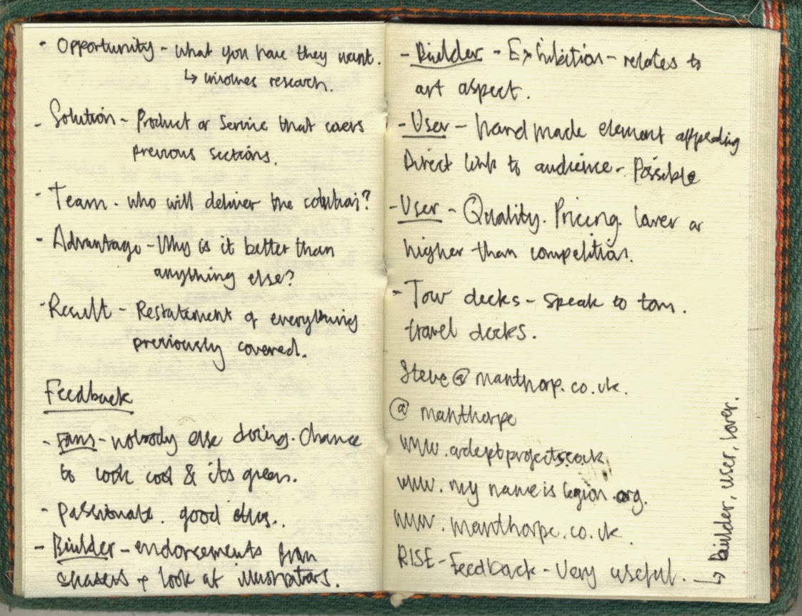
The session was started by going through the basics of what makes a business, notes that were taken during this part of the session are listed below; 


Additionally, at the end of the session we were given a print out that featured the slides Steve talked through during the session, this is useful as it features information that I missed.


After Steve talked though the specifics of what makes a business we were divided into small groups to complete a task. Using the 'COSTAR' method of assessment we were asked to talk though a business idea using each of the sections listed below;
  • Customer - Identify, characterise, role-play.
  • Opportunity - What you have they want.
  • Solution - Product or service you will offer - covers previous sections.
  • Team - Who will deliver the solution?
  • Advantage - Why is it better than anything else?
  • Result - Summary of most important points discussed.

As I had the most developed idea of my group we decided to use the 'COSTAR' assessment method to evaluate my business concept. Notes were listed on large sheets which I stupidly forgot to take pictures of.

After creating points for each section of the assessment method on large pieces of paper we had to present the idea to the rest of the group, who then in-turn gave feedback on the idea. 

Something that really grabbed my attention, other than the feedback given on my idea, was the method used to organise and create the feedback. Steve used a method called 'RISE' which divided the group giving the feedback into three sections; Fans, Builders & Users. It was the job of the fan to list all the positives they perceived from the idea setting a positive tone immediately. Next, it was the job of the builders to offer feedback that built upon the idea, giving information on what could be done to possibly improve it. Finally, it was the job of the user, who had to imagine they were a part of the target audience to say if the idea appeal to them and why. The feedback method worked really effectively, allowed students to discuss ideas and generated lots of informed useable information. In fact, I found the method so efficient that I plan to propose using it in future criticisms.    

Overall, I thought the session was really useful, gave me plenty of relevant information and filled me with confidence about my idea. 


PPP3 - INSPIRATION

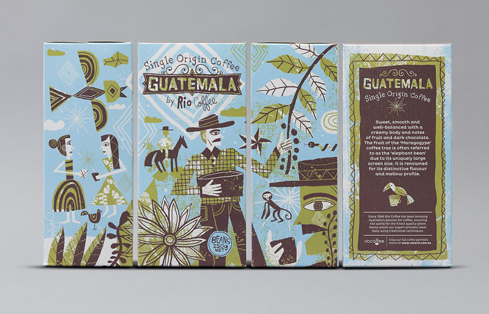
Today while browsing the internet I randomly came across some inspirational packaging designs that successfully apply a colorful, eye-catching illustration style that captures the excitement of the product while simultaneously grabbing the customers attention.

The series of packaging designs were created by illustrator Nate Williams to house a range of coffee produced by an artisan Australian company named 'Rio Coffee'. Products belonging to the 'Single Origin Coffee' range are sourced from four different parts of the world, Brazil, Kenya, Australia and Guatemala. Therefore, playing on this aspect, the concept for the packaging designs is based on imagery that has a cultural relevance to the coffees place of origin, illustrating aspects of the landscape, people and coffees production. 

I find the packaging designs inspirational due to the effective application of the illustrations and their representation of the origin countries in which the coffee is grown. Through the successful application of a strong concept, engaging illustration style and cohesive colour schemes the illustrator has developed a themed series of packaging designs that jump off the shelf when compared to other competing products, something which I can truly appreciate as a graphic designer.   


Friday, 14 November 2014

PPP3 - INSPIRATION

For this weeks inspiration post I decided to feature an environmentally focused infographic video published by 'Get Up Australia'. The three minute video aims to raise awareness of the environmental implications currently faced by Australia's 'Great Barrier Reef'. 

In the video, information is presented that reviews the approval by Australian government officials to let 'Adani', a huge multinational energy company, to expand a huge coal terminal on the East coast of Australia. Associated with this decision are multiple environmental problems that could seriously affect the well being of the Great Barrier Reef, a protected world heritage site that will soon be listed as 'In Danger'. 

For me, the video is inspirational for many reasons, both personal and professional. Firstly, on a personal level, the information that is communicated appeals to my interests, has direct relevance to my ethics and beliefs and subsequently helps to raise awareness of issues I am very passionate about. Moreover, the videos primary objective aims to raise awareness of environmental issues to the general public, essentially helping to facilitate movements that will combat environmental exploitation by powerful corporations. 

On a professional level, the video is inspirational due to the methods applied to communicate the information featured. When discussing controversial environmental issues it is important to present the audience with hard, evidenced facts to help highlight the many problems and their possible implications to wider society. The video successfully achieves this, presenting facts that outline the various facets of the issue using infographic visuals to effectively communicate information to the audience.  


Monday, 10 November 2014

PPP3 - BUSINESS CARDS - FINISH

As part of last years PPP module I created a complete brand identity for myself so that I could professionally represent myself as I start engaging with industry professionals and clients. During the physical production of the business cards I encountered many problems ranging from the print quality of the small type to a disaster during the edge painting process which left the majority of the cards unusable. 

As a result of the various problems encountered while producing the cards I was left with only a selection which have all now been distributed. Recently, while attending an event at the Manchester Print Fair I was reminded of this problem when I didn't have a card to give to people that I had conversations with. Therefore, before progressing any further through the year I decided to create a fresh new batch of business cards that can be distributed to potential clients and industry contacts.

The cards design had already been created as part of my personal branding during second year therefore, to create the new batch I just simply needed to physically produce them. 

Learning from the mistakes made last time I decided to use a smaller A3 screen so that more pressure can be applied when printing to ensure that the small 6 point type is clearly legible. Another problem I encountered when producing the last batch was when edge painting the cards. The painting process was completed outside on a relatively windy night, to reach the cards the can had to be held close which resulted in the spray paint being applied too thickly, this in turn resulted in paint bleeding onto the surface of the card. To avoid the same mistake paint will be applied lightly to small piles of cards and in an indoor environment. 


THE PROCESS 

Cleaning the screen. 

Mixing paint and gel medium.

Applying paint mix to screen.

Printed cards on recycled grey board.

Business cards post 4 hour cutting session. 


Saturday, 8 November 2014

PPP3 - INSPIRATION

For my second inspiration post I decided to focus on music instead of some kind of visual element. I believe that as graphic designers we should not be restrictive with where inspiration is taken from and instead expand our sources as widely as our consciousness will let us. 

Featured below are two songs from an Australian based band called 'Hiatus Kaiyote', who describe their music as 'Multi-dimensional, Polyrhythmic Gangster Shit', or as defined by Wikipedia; 'a neo-soul quartet'. Whatever definition is used to label this band simply cannot justify the inspiring ingenuity of the music they produce.  

I was introduced to the band by a friend and ever since have become completely mystified by their music which derives inspiration from soul and jazz music. To me, their songs acts as a soul touching breath of fresh air amongst the majority of music produced today. Personally, I find the music created by Hiatus Kaiyote inspirational for a range of reasons, but the most predominant ones are its capability to transport me to somewhere different in my consciousnesses and its ability to infuse me with the lyrical creativity of artist and inventiveness of the music. 


Monday, 3 November 2014

PPP3 - NATIONAL FOREST

An inspiring studio that I discovered while collecting visual research for a previous project is Californian based National Forest. The studio cover a range of disciplines from art direction to illustration allowing them to take on a range of creative briefs for forward thinking clients.

One of the reasons I find the studio inspiring and relevant to my design practice is because of their list of clients and consequent work produced. As previously discussed in my PPP presentations skateboarding has always been at the forefront of my interests and, at National Forest, they work with some of the industries most renowned companies such as Element and Habitat skateboards. Moreover, the creative freedom given to the agency by such clients has allowed National Forest to develop original outcomes that push the boundaries of what can be produced. 

The images below document the content found on the national forest website;


NATIONAL FOREST - INSPIRING WORK  

Some work that appealed to me as I browsed through the National Forest projects is displayed below; 

ELEMENT SKATEBOARDS -

National Forest have produced a range of work for Elements Skateboards ranging from illustrative board graphics to apparel design. As a designer I am also really interest in illustration, both hand and digitally rendered, and so I find the graphic work produced by the agency aesthetically engaging and inspiring.


MADE GOODS - 

Made goods are a global furniture company for which National Forest developed an advertising campaign and art direction to help the company grow and expand. The project caught my attention due to the application of vibrant colours and consistent editorial layouts.


A COMPANY OF PARROTS -

Company Of Parrots is a business based in London who work with artists, designers and creatives to develop a range of apparel and other printed goods. The company lacked a strong, consistent identity, and so National Forest helped to create a logo that can be used to represent the company.


All work taken from - National Forest.

Sunday, 2 November 2014

PPP3 - INSPIRATION

As part of the PPP module I decided to start creating regular blog posts documenting inspirational material discovered while going about my everyday activities. Anything that catches my eye or motivates my creativity in any way will be documented. I believe that by expanding and documenting my sources of inspiration I am exposed to will subsequently improve creativity and help to develop and inform my identity as a designer.

The image below displays a small section of an Indian style wall hanging that is currently hanging in my living room. The intricate details of the illustration and cohesive colour pallet helps to create an aesthetically engaging image in a style reminiscent of the continent in which it was created.