Tuesday 26 February 2013

ESSAY FEEDBACK


RESPONSES 

Be less specific in the introduction (reffering to the mention of El Lizzitskys work).

Possibly look at another academic reading to support points made throughout the essay.

Use Findley text to support points made in the second half of the essay (referring to points made about Hirst and Lizzitsky) .

Revise structure 

Monday 25 February 2013

STUDY TASK 7 - WHAT IS DESIGN PRACTICE?

Todays session revolved around the three adds that were produced in response to last weeks task.

First, we recapped the words we used to describe our design practice and personal attributes, mine are shown below.

PRACTICE 

  • Organised
  • Illustrative 
  • Informative
  • Print
  • Handmade 
PERSONAL

  • Focused
  • Organised
  • Committed
  • Creative
  • Outgoing

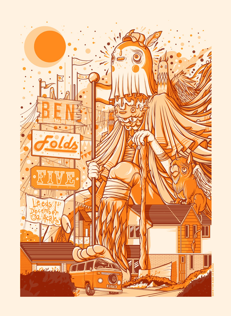
Next, we reviewed the designs created for us by each person. After looking at each design we were asked to make a list of five words that the add communicated.


We then compared the aesthetic qualities communicated by each add, against the words generated on our list of attributes. We listed 'does' for if the design had elements that were useful, and 'doesn't' if the design has elements that didn't communicate my design signature. 


Next, we moved tabels so that we were surrounded with a new set of adds created for a different group. We then preformed a similar exercise listing the messages that were communicated about that person by each of the adds. The feedback was then left on the desk so that we could review the comments made.

After reviewing the comments I noticed that some related to proffessional practice and others to my personality, this was because of the content of the add. 

This in turn started a discussion about the tone of voice used in the add. We discussed if it was beneficial or not to use a tone of voice that is personal to you and include information which portrays your personality. We created a tabel to weigh up the pros and cons associated with the tone of voice.


Finally, Fred then explained the importance of including a portrayal of your character within a personal add or C.V. The add will be a representation of not only your work as skills as a designer but also your personality. Including aspects of your personality will help the employer/client see if you are the sort of person they want to work with. For example, if you have the same common interests as the team of designers looking for a new addition to their studio, it would be more likely for you to get chosen for interview. 

Find the balance between what makes you, you and what makes you a designer.


TASK

Finally, at the end of the session we were set a task. I am required to write 5 statements about myself and associate each point with an image.
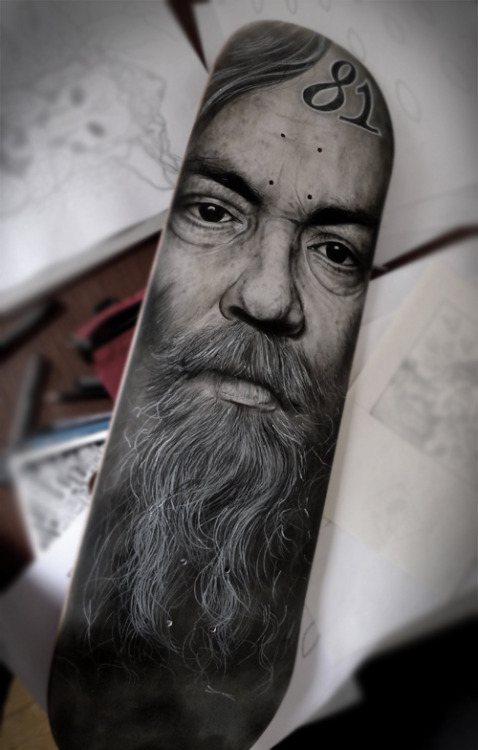


SKATEBOARDING.

I started Skateboarding when I was a young kid, after stopping for a number of years I got back on the board sometime during my second year at college and since then it has been a definitive part of my life. When you start skateboarding you don't start a sport, you start a lifestyle, and it is because of this that I get so much satisfaction from skateboarding. I find it almost addictive, there is the sense of joy and satisfaction when you finally land a trick you have been trying for ages, and the feeling of freedom you get when cruising round with a group of close friends. 

Additionally, skateboarding also brings a whole culture with it, from music to fashion to art, there are a range of disciplines that have relevance to the sport. Skateboarding was a huge influence on my creative development as a child, as I fell in love with the illustrations created for the bottom of skateboard decks.

Illusrtators are prodominantly associated with skateboarding because of all artwork created for skateboard decks and t-shirts. Today I am still fascinated by designers and illustrators that create work for the skateboard industry, such as Godmachine and Paul Jackson.


Designs created by Paul Jackson 


ILLUSTRATION

Another area of my interest lies within illustration and the art of drawing, I think that being able to draw is an important and essential skill to develop. For as long as I can remember I have always found drawing relaxing and enjoyable, I think there is something therapeutic about being alone and drawing with subtle music on in the background. 

Since my interest in illustration started I realized that the only way to progress to the level I want to is by practicing everyday. I try to do this but a busy lifestyle prevents me from devoting the amount of time I want to dedicate to the subject. I am a perfectionist, and I always set my standards sky high, because of this I don't think I will ever be satisfied with my skill level within illustration. However, drawing at every given opportunity will help me get there.

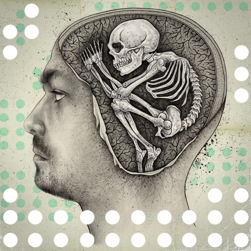
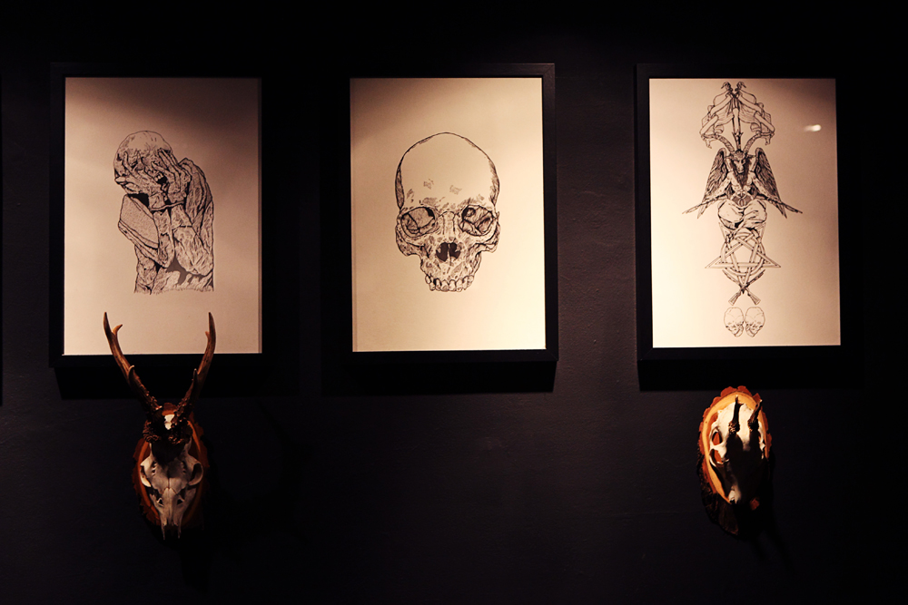
My fascination with skateboard illustration lead me to discover the world of tattooing, this is another area which I am absolutely fascinated by. Mostly because of the skill level and mind set of tattoo artists who are devoted to achieving perfectly accurate lines on every piece they touch. The level of skill within this industry is mind-blowing, and it keeps progressing with innovative ideas and devoted artists. 

Recently, I became so infatuated with it that I had to try it myself, so I purchased a tattoo gun to teach myself the basics. I designed a tattoo, and tattooed it onto some pig skin. It is completely different to anything I have tried before, its hard and demands high concentration levels for hours at a time. Despite this I found tattooing the design really enjoyable, it is definitely a skill-set I want to develop at some point in my life.


Illustrations created by illustrator French


My first tattoo attempt.


GRAFFITI

Having an interest in skateboarding and illustration also lead me to discover graffiti. I have always been fascinated by typography and how letters can be adapted, discovering graffiti opened up a new world of inspiration. As artists that are involved in the scene push the limits of letter manipulation in so many different ways. Something that has kept me interested in graffiti is the range of styles, some artists create impressive but illegible pieces which force the viewer to figure out the piece, while others create big bold letters which are easy to read, there is so much scope and something to everyone's taste. 

Although I have never experimented with using spray-paint as a medium before, it has always interested me, as you can achieve effects with it that cant be achieved with other mediums

ROIDS - MSK


CAMPING

The summer before I came to university was filled with camping, festivals and skateboarding (weather permitting). We went regularly visited a place called Dinckley, which is essentially just a river surrounded by fields and woods, here we spent the summer nights swimming in the river, drinking and generally relaxing. Nothing beats chilling with a close group of friends in a secluded, beautiful spot like that. It was awesome. 

I have always enjoyed camping and the outdoors, buts its times like this I look forward to when working hard through the grey winter days!

Swimming in the river - Dinckley.


SUMMER

Finally, the combination of sun, friends, skateboarding, beer, drawing, design, camping and festivals make summer fun. Most of the things I enjoy are amplified when the weather is good, and for this reason I love summer. Despite the weather getting worse by the year. 

I feel at home when the sun is shining which is strange coming from a boy who has grown up in the dull, grey north of England. I need to consider a change of location,somewhere with  a lot of sun would be perfect. However, to get there I first need a portfolio which will make employers from around the world want to employ me. Hard work here I come! 

Longridge moor - Blue lagoon - 2012


Monday 18 February 2013

MODULE ASSESSMENT FEEDBACK


STUDY TASK 6 - WHAT IS DESIGN PRACTICE?

tartFragment-->“[Graphic Design is] An ongoing examination/conversation between the dynamics of
personal exploration and professional practice”
– Matt Owens, Volumeone.


There are three ways in which we can start to think about design practice.


  • Appropriateness of response (appropriate to brief/target audience)
  • Quality of resolution (Aesthetically engaging)
  • Meeting the deadline (Produced in time to meet the deadline)


When thinking about our own personal design practice we need to consider what it is we want to do as designers, and what we need to do. Our own personal taste and preferences affect this.


Moreover, our rationale is affected by our own preferences, what we want to do/design and why and the reasoning behind our design choices. 

As designers our work can be affected by how we approach our design process. Our approach to a project can usually be defined by three different design approaches that are as followed;

Concept driven
Ideas driven
Research driven

Different briefs require different approaches, such as if you are designing for a specific audience, context or media.

Other things that can affect our rationale is our priorities as a designer, such as if the design and creative aspect of a design is everything. Moreover, ethical priorities can also affect the clients we work for, such as some designers would not design for large corporations and businesses whereas others only design for commercial purposes. 

There are complex relationships between the topics and finding were you sit within them is vital to your personal design practice.

Moreover, our rational is also affected by how we work, such as if our work is; 

  • Handmade
  • Digital
  • Lens based

Or the dimensions of the outcome;

  • 2 Dimensional (paper)
  • 3 Dimensional (Object - packaging)\
  • 4 Dimensional (Movement/Time - Sequence of posters)

We can improve the quality of our resolutions by carrying out on going evaluations of our outcomes. The quality of a resolution can be affected by numerous factors;


  • Depth of appropriate research
  • Breadth of initial ideas
  • Selection of potential solutions
  • Thorough visual development
  • Attention to detail / Crafting
  • Clarity of presentation

Additionally, considerations need to be thought about with regards to the useage of type and image to communicate a message, and the usage of media. Does the media used conflict or support the message.  


TASK

Near to the end of the session we were given a sheet of 10 questions to complete, these were relevant to the topics discussed in lesson and required us to list things such as our 5 strongest design skills. 


After writing our personal responses to each task we were divided up into small groups were we then presented our information. I was put into a group with Adam and Alex, as each person presented their information we took detailed notes, Fred then introduced us to the task.

ADAM


  1. Adam Garbutt
  2. Hand made, Digital, Illustrative, Solid colour, Concentration.
  3. On time for deadlines, Creative, Friendly, Open.
  4. Manipulation, Illustration, Typography, Hand made, Photography.
  5. Advertising, Motion Graphics, Flyers, Leaflets and hand-outs.
  6. Olly moss, David Shrigley, Saul Bass, Sagmeister & Walsh.
  7. Digitally Illustrative (simple yet effective communication), Simplification of ideas. 
  8. Pretty shitty, Computer Arts.
  9. Freelance/Independent work, Own Studio.
  10. Hard work, Commitment, Make industry connections.


ALEX

  1. Alex Dyson, Behance.com/AlexDyson
  2. Clean, Simple, Well Presented, Experimental, Modern.
  3. Hungry, Motivated, Sleepy, To the Point, Fun.
  4. Photoshop, Illustrator, Photography, Drawing, Curiosity.
  5. Branding and Identity, Information and way-finding, Album artwork, Posters.
  6. Drew Milward, Sagmiester and Walsh, Cube 3, We are Good.
  7. Wearecube3.com, Wearegood.com
  8. Computer arts, Creative Review, Design Inspiration, Design week, Identity Designed.
  9. Individual, Signature work, Experience, Designs.
  10. Efficient, Skilled, Experimental, Clever, Individual. 


We are required to design a free add that will communicate the design practice of myself and the two other members of my group. The add needs to reflect the design practice of each member, and will be presented at 


RESEARCH 

I started by collecting some visual research into some design free adds.


Simple effective add, the style it has been created in makes me think that the designers style will be hand rendered and illustrative. Additionally, the add is effective as its simple and uses an intense yellow background color that grabs the audiences attention. However, I think the add would benefit by having something to put it in context, as it is not mentioned that the add is advertising a designer.  


This add is a lot more appropriate as it gives the audience an introduction to the stye of the designer, and provides information regarding the designers name and how to contact him.


Finally, I looked at this design. As an advertisement it is effective, it clearly states the speciality and introduces us to the designers. However, if being produced to advertise the designer, contact i name information would need to be added.


The add needs to capture the individual tastes and style of each designer to accurately advertise them. Therefore, I research further into the information gathered from the questions, and support this further with information gathered from their personal blogs regarding artists and aesthetic preferences. 

ADAM


These three posters were created by Olly moss an illustrator mentioned as one of Adams favorite designers. The posters are designed in a very illustrative way relying on image to communicate the message. 


Additionally, Adam also listed David Shrigley as one of his favorite designers. Shrigley creates simple illustrations which often have a funny tone of voice. I could possibly create an illustration in a similar style for his add.


These designs were created by designer Saul Bass another one of Adams favorite designers, they all use a mix of type and illustration to communicate their message. 


Finally, I have used Adams favorite designers work to form my visual research. I plan to create a simple Saul Bass style illustration to support the information that will be communicated through typography.


ALEX


Image taken from Alex's behance page, its shows a selection of his past projects, looking at these will help me get an idea of style.

Illustrative logo created for Satans Hollow.


Illustrative logo created for a t-shirt design.


Moreover, you can also look at projects from professional designers that he has appreciated.


Joshua M Smith


Beatrice Mikulskyte


Next, I looked at a collection of work from his artists to get a further understanding of the work Alex likes. 


Illustrated screen-print poster created for a Ben Folds gig by Drew Millward.


Public Bike Poster

Public Bike Poster
Above is a piece by Sagmeister and Walsh, the poster is illustrative and uses a pattern of bike chain to form the posters content. A lot of work from Sagmeister and Walsh is clean, modern and focused.


Beer labels created by Wearegood.com, aesthetically effective as the labels are clean and used a limited amount of colour. 


I used a range of images collected from the inspiration given when Alex answered the set of questions, I will combine this with the other responses regarding how he works to help me create an add which accurately portrays him as a designer.


DESIGN SHEETS

Before I started designing the adds I made some design sheets to explore my ideas for each add.


FINALS


ADAM


ALEX


MINE


Friday 15 February 2013

DESIGN IS ABOUT DOING - CRITICISM

Today, we had our group criticism, we were first split into small groups where we presented our design sheets and five visual variations. After we presented our ideas and explained how the project was progressing, we then discussed as a group how the outcome could be improved and made suggestions as to how this could be done. 

I presented my work first, showing my design sheets, then visual variations. My designs were well received, especially the 'Iwo Jima' design that I had previously digitally produced. I then received feedback from the group which is shown below. 


FEEDBACK

  • Explore my favourite visual variations digitally.

  • Produce a digital illustration of the Balaclava design.


  • In my portrait grid design I could consider creating a grid of coloured squares to go behind each of the vector portrits.


  • When creating the grid I could consider using the same color scheme that I used in my 'Iwo Jima' design. 

  • Everyone was really impressed with the digital mock-up of my 'Iwo Jima' design, but it was mentioned that some lines in the illustration could be tidied up and made more accurate.


PROGRESSION 


I will produce a digital version of the 'balaclava' design, as the composition and relevance of this design is stronger than the portrait grid. After reviewing the layout of the portrait grid I found a problem regarding the spacing between the illustrations. Therefore  I decided not to develop this design any further.