Wednesday 29 April 2015

PPP3 - PRESSISION PRINT - VISIT

Today me, and a small group of other students, traveled to the outskirts of Leeds to visit Pressison Print, a small creative print house offering a range of print and finishing services. 

Unlike most conventional printers that simply produce the work sent to them by their clients, the team at Pressision like to have more creative input with the jobs they take on. Therefore, they often work closely with designers to achieve the best possible results both aesthetically and financially. 

For me, visiting the printers was a first, as previously i had never been to a commercial print house despite being a print focused graphic designer. Therefore, seeing the various pieces of equipment and learning about the different stages of their individual processes was fascinating.  


During the visit I took a range of images and videos documenting some of the things we were shown during the visit;


The large HP digital printer was the newest edition at Pressision and had the ability to print white ink! 


Offset lithograph printer. 


Printer ink well filled with some beautifully coloured ink. 


BEAUTIFUL BUSINESS CARD 

At the end of the visit we were each given one of Pressisions beautiful duplex business cards, which act both as a means of distributing contact details and showcasing the beautiful results that can be achieved by printing with the company. 


PPP3 - START UP WEDNESDAYS - EVERYTHING LEGAL

Today I attended another one of the 'Start Up Wednesdays' sessions which, this week, was headed by an enthusiastic and engaging solicitor called Keith Arrowhead. 

The session was very useful and thoroughly enjoyable as Keith presented us with a range of relevant legal advice and information on how to choose the correct legal structure for a business while simultaneously telling fascinating stories with relevance to the topic in hand. 

As a student considering starting my own venture, the information Keith gave us was invaluable, enlightening and essential knowledge for anyone thinking of becoming self employed. 

Unfortunately, only a select number of students turned up for the session, however, this subsequently meant that Keith could learn about our  business ideas and give us legal advice specifically suited to our own individual ventures. 


Notes taken during the session are listed below;


IMPORTANT POINTS;
  • Creative cultural skills - Intern funding - VERY USEFUL! 
  • A good lawyer brings clarity to a situation. 
    • Knows about a business and its aims.
    • Helps to achieve.
  • There is no protection for a business idea - people could easily steal.
    • Choose the time to reveal your idea carefully.
  • Businesses need structure.
    • What type of business do I want?
    • Joint ventures and collaborations are the same things with different names.
    • In co-operatives, each member has a vote.
    • A sole-trader is a one person business - personal assets liable for seizure if bankrupt.
    • Incorporate to avoid personal liability.
  • Companies house - Website for checking business name availability - VERY USEFUL! 
  • Knowem.com - website for checking social media name availability - VERY USEFUL!
  • Businesses can be protected by a trademark - This is free.
  • However a registered trademark is not free - registration costs £170 and lasts 10 years.
  • Design rights protect how a design looks.
    • £60-70 for 10 years protection.
    • 1 year to decide whether to protect.
  • All design work is protected by copyright - you do not have to register anything.
  • Acknowledging your copyright shows value of work.
  • Copyright is always retained by the creator unless they are working for a company or a deal is made.
  • Copyright lasts for 70 years. 


Saturday 25 April 2015

PPP3 - WORK IN SKATEBOARDING - FEATURED ARTICLE

A few weeks after submitting the final design for the digital publication it was featured on the Work in Skateboarding website, accessible to a huge audience spanning the globe. 


Friday 24 April 2015

PPP3 - ROBOT FOOD - VISUAL RESEARCH

After creating the concept for the small gift I am planning on taking with me to Robot Food I progressed with the project by collecting a body of secondary sourced inspirational research. 

The body of research will focus on two individual elements of the project, the various labeled parts of the jar and the external packaging element. 

The projects and products featured were all selected specifically for their high standard of design and functionality, something which I hope to translate into my outcome to ensure the gift is well received.  


LABEL RESEARCH

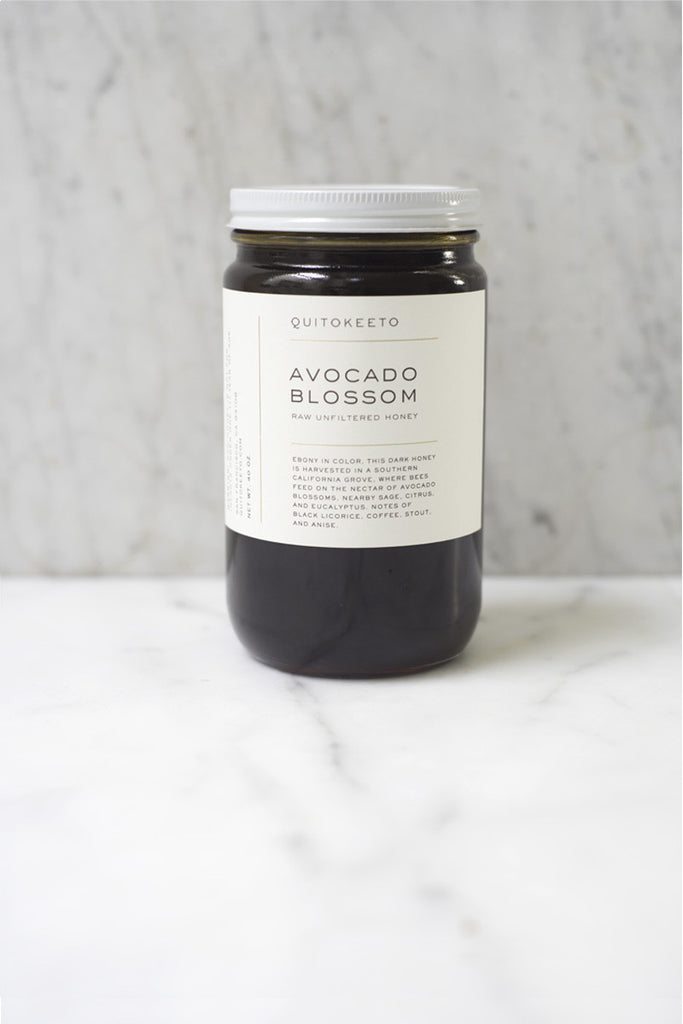
QUICKOKEETO - PRODUCT RANGE  

Olive Blossom Honey


Avocado Blossom Honey

INSPIRATIONAL ASPECTS;
  • Beautiful contrast created between the colour of the product and the pure white label.
  • Simplicity of the label design makes it easy to identify what the product is.
  • Clear typographic hierarchy helps to differentiate between different aspects of information. 
  • Negative space left under the label helps to create a nice visual balance. 


OLD SALT - COCONUT SUGAR 

Packaging Design Inspiration

Salt Trader Gift Set - Lime, Black Powder, Sea Smoke & Original by Old Salt Merchants on Scoutmob Shoppe. In perfect nautical themed packaging.

INSPIRATIONAL ASPECTS;


  • The stock colour forms a nice contrast with the jars contents and adds a retro feel that has relevance to the brand identity.
  • The paper seal used to connect the front and back labels is a nice addition to the overall aesthetic and allows for the addition of extra information. 


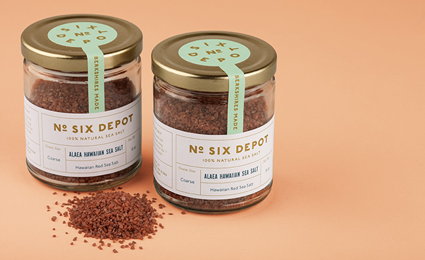
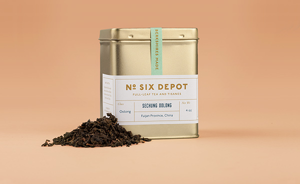
No. SIX DEPOT - PERKY BROS LLC


INSPIRATIONAL ASPECTS;


  • Typographic colour application helps to further reinforce type based hierarchy.
  • Line effectively used to divide content.
  • Paper seal uses a circular element which fits the contours of the lid perfectly.


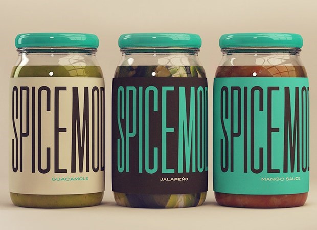
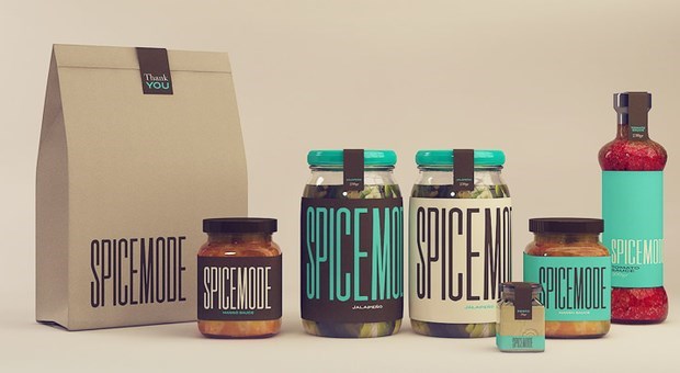
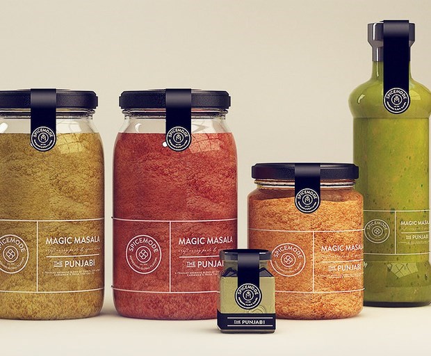
SPICEMODE - PRODUCT RANGE 


INSPIRATIONAL ASPECTS;


  • The lid colour and type on the large spicemode jars matches to form a nice aesthetic balance.
  • Clear labels have also have an effective application when used with white ink. 
  • Again, lines are effectively used to space content.  


EXTERNAL PACKAGING RESEARCH 

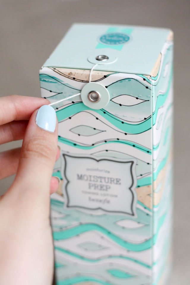
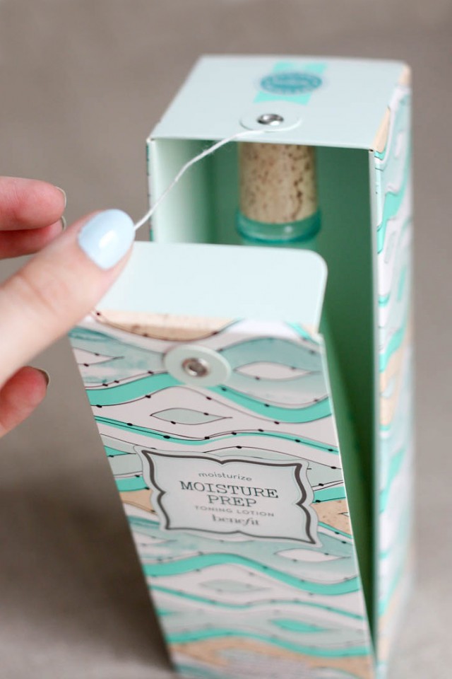
BENEFIT COSMETICS - MOISTURE PREP 


INSPIRATIONAL ASPECTS;


  • Opening mechanism reveals product in an interesting way - showcases bottle design once open.
  • The string closure method could be fiddly and is not very functional.  


MARTINI - PACKAGING 

Martini by Martín Berasategui Advertising company: 6 Grados Design of the welcome pack for the ceremony / dinner / event that Martini organized in Italy, led by Martín Berasategui, where the secret formula of this famous vermouth was revealed.

INSPIRATIONAL ASPECTS;


  • The Martini packaging utilises a simple design to great effect, using an interior box that falls open to reveal the product as the top is removed. 
  • Packaging also cleverly uses a slots to hold a promotional booklet and other additional material.


24 BOTTLES - PACKAGING 


INSPIRATIONAL ASPECTS;


  • Packaging uses a clever system that simultaneously holds and protects the product inside the exterior packaging.


DROP COFFEE ROASTERS - PACKAGING 


INSPIRATIONAL ASPECTS;


  • The natural colour of the stock forms a nice visual contrast with the dark colour of the printed type. 
  • Sticker used to seal box. 


After analysing the various projects and products I made a list of elements I want to integrate into the design of my gift. 

  • Natural coloured stock.
  • Paper seal on jar.
  • Exterior packaging stock and jar label stock should visually complement each other.
  • Packaging should reveal and showcase product.  


Thursday 23 April 2015

PPP3 - SANDU PUBLISHING UPDATE

Today I got an update from Javier Zheng from Sandu Publishing informing me that some images of the publication I am featured in are now up on Behance. Furthermore, the book will be published globally in the next two weeks, becoming available for purchase on the 11th of May.  

It has been a number of months since I last spoke to Javier about the publication so it is really nice to see the physical printed outcome. 


May long name can be seen on the cover of the book towards the bottom right hand corner of the cover. 


Friday 17 April 2015

PPP3 - INSPIRATION

Today, while checking the YCN website I came across this genius advertising campaign for Depaul UK's Nightstop programme. 

The campaign, created by Publicis London, aims to help change the perceptions and stereotypes surrounding young homeless people, inventively utilising the architecture of buildings to cleverly communicate how there are two sides to every story. 

The campaign really speaks for itself, and delvers a powerful message in a way that will force people to reconsider their view of the homeless.


Wednesday 15 April 2015

PPP3 - WORK IN SKATEBOARDING - CONCLUSION

Firstly, the Kim Woozy editorial layout project was completed as part of my work experience for Samantha Chami, founder and owner of 'Work in Skateboarding', an American company focused on providing people interested in working within the skateboard industry with the relevant information and support to do so. 

After sending Samantha some of my work and securing a place on the programme I was informed that I would be working to professional standards, facing the challenges and adhering to many of the limitations editorial designers encounter when working professionally within the design industry. The projects were ran very much in this way, with me initially receiving a brief, deadline information and project file containing all of the relevant content needed for the outcome. My job was simple, read the brief, review the featured interview and create an editorial layout that composes written information and supporting visuals in an engaging way that doesn't distract readers from the content.

Due to how the programme was run, with a short turn around time for the publication and specific limitations to publication size, featured content and submission requirements, the project provided me with valuable, industry specific experience. Additional to the professional way in which I had to work when completing the project, I also was engaged quite consistently in email based communications with the client, who, living in America, relied solely on digital communication when discussing aspects of the project. Client based communication is a process every designer is faced with, whether it be digital or analogue, and so experience gained in this area is both relevant and valuable to my professional practice. 

Time management is an aspect of my practice I have consistently outlined in every evaluation as an area I need to improve. As part of the project, I was required to work to a strict deadline, with the first draft submitted just five days after initially receiving the brief. Working to such a short turn around time really benefited my organisational skills, as I had to balance the project alongside a number of larger projects and wanted the outcome finished to a high standard in time for the submission deadline. Through careful planning and focused periods of production I was not only able to finish the article in time, but in fact finished it a few days before the submission deadline, allowing me to review my work and make small improvements to the design before sending the outcome to Samantha. 

Overall, I feel the project went really well, the publication was completed to a high standard and was submitted in time for the submission deadline. Furthermore, Samantha was really impressed with my work, so much so that the article was published a few weeks later. 

Monday 13 April 2015

PPP3 - INSPIRATION

Today I watched an inspirational video detailing the printing process used on the cover of Craig Oldhams newest book 'In Loving Memory of Work'.

The book is a visual record of the miners strikes that took place in England during the 1980's, documenting the events with images and artifacts collected by Oldham and his family, some of whom were miners involved in the strikes.

The aspect of the publication I found most inspirational is the innovative wrap-around cover, which Oldham chose to print using coal dust taken from the site of Barnsley Mill in South Yorkshire. 

The video embedded below documents the print process and the stunning effect the printed coal dust creates.

Thursday 9 April 2015

PPP3 - PRESENTATION FEEDBACK

On Friday we presented our final PPP presentations which discussed our progression through our three years on the course and potential progression opportunities. 

Towards the end of the day the group was divided in half to ensure that the session finished at a reasonable time. However, due to this decision not everybody was able to see my presentation, both class members and tutors alike. 

Once the session was over I briefly spoke with John about my presentation and the PPP module, after which he asked me to forward him the slides from my presentation so he could give me feedback. 


PRESENTATION FEEDBACK

I forwarded John a link to the PPP blog post documenting my presentation and supporting notes to which I referred to while delivering my presentation. John made the effort to review my work and responded with the useful advice and relevant feedback displayed below, something that I am really appreciative of. 


Tuesday 7 April 2015

PPP3 - INSPIRATION

Additional to my woodland adventures, I also started shooting photographs on my camera Olympus RC35 film camera, something that I have lost touch with since starting third year in September. 

Film based photography has been something that I have always had a passion for and found thoroughly enjoyable. The quality and character of the outcomes, sometimes unexpectedly so, have a certain personality that just cannot be achieved while shooting digital images. Furthermore,the fact that, much like print based design, the medium of film is slowly becoming obsolete as we progress further into the digital era, only adds to the qualities that make the medium appealing. 

I took the image below while on one of my adventures, shooting with my iPhone through the viewfinder of the camera. Images taken during the days spent exploring the woods will be posted once they have been developed.

Sunday 5 April 2015

PPP3 - INSPIRATION

I spent this week of the Easter break at my mothers house, which is situated in a beautiful little Lancashire village called Whalley. Conveniently for me, an absolute nature fanatic, her house is only a five minute walk from some amazingly beautiful countryside and woodland areas, so I had the opportunity while staying there to experience it on a daily basis.

Most days, I would wake up just as the sun was coming up and go for a long walk exploring the different aspects of the surrounding landscape, something I have truly been missing while living in the city.

Morning spent alone in the woods can be really meditative and soul reviving, especially when surrounded by wildlife like roe-deer and foxes which I saw on a regular basis. 

Below are some image I took on my iPhone showing some of the interesting visuals and textures that can be found within nature that I believe could transfer well into a pattern or design element.