It has been a few weeks since I submitted the final draft of the Kim Woozy article to Samantha and although the final submissions for both the PPP and Extended Practice modules and fast approaching, the editorial design work experience programme will continue running for a few months after I actually finish university.
I am expecting to receive the brief for the next digital publication in the following week, so although I will be insanely busy preparing for the submissions I will have to put my organisational skills to the test and complete it alongside the heavy workload.

Showing posts with label WORKINSKATE. Show all posts
Showing posts with label WORKINSKATE. Show all posts
Thursday, 14 May 2015

Saturday, 25 April 2015
PPP3 - WORK IN SKATEBOARDING - FEATURED ARTICLE
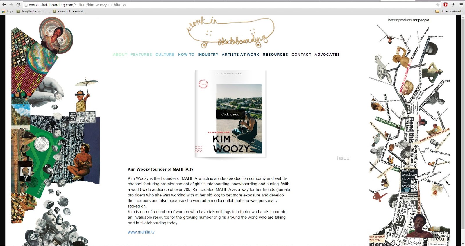
A few weeks after submitting the final design for the digital publication it was featured on the Work in Skateboarding website, accessible to a huge audience spanning the globe.

Wednesday, 15 April 2015
PPP3 - WORK IN SKATEBOARDING - CONCLUSION
Firstly, the Kim Woozy editorial layout project was completed as part of my work experience for Samantha Chami, founder and owner of 'Work in Skateboarding', an American company focused on providing people interested in working within the skateboard industry with the relevant information and support to do so.
After sending Samantha some of my work and securing a place on the programme I was informed that I would be working to professional standards, facing the challenges and adhering to many of the limitations editorial designers encounter when working professionally within the design industry. The projects were ran very much in this way, with me initially receiving a brief, deadline information and project file containing all of the relevant content needed for the outcome. My job was simple, read the brief, review the featured interview and create an editorial layout that composes written information and supporting visuals in an engaging way that doesn't distract readers from the content.
Due to how the programme was run, with a short turn around time for the publication and specific limitations to publication size, featured content and submission requirements, the project provided me with valuable, industry specific experience. Additional to the professional way in which I had to work when completing the project, I also was engaged quite consistently in email based communications with the client, who, living in America, relied solely on digital communication when discussing aspects of the project. Client based communication is a process every designer is faced with, whether it be digital or analogue, and so experience gained in this area is both relevant and valuable to my professional practice.
Time management is an aspect of my practice I have consistently outlined in every evaluation as an area I need to improve. As part of the project, I was required to work to a strict deadline, with the first draft submitted just five days after initially receiving the brief. Working to such a short turn around time really benefited my organisational skills, as I had to balance the project alongside a number of larger projects and wanted the outcome finished to a high standard in time for the submission deadline. Through careful planning and focused periods of production I was not only able to finish the article in time, but in fact finished it a few days before the submission deadline, allowing me to review my work and make small improvements to the design before sending the outcome to Samantha.
Overall, I feel the project went really well, the publication was completed to a high standard and was submitted in time for the submission deadline. Furthermore, Samantha was really impressed with my work, so much so that the article was published a few weeks later.
Wednesday, 1 April 2015
PPP3 - WORK IN SKATEBOARDING - FINAL SUBMITTED OUTCOME
The document displayed below is the final outcome after it was resubmitted to Sam with the additional photo credit on the cover.
Friday, 27 March 2015
PPP3 - WORK IN SKATEBOARDING - EDITORIAL DEVELOPMENT
After defining the individual elements that will help to form the publications aesthetic I had all the relevant information and content needed to progress with the outcomes design.
LAYOUTS
The design process was started by first developing a range of thumbnail layouts exploring potential page compositions for the article.
As the outcome is being designed for a digital platform and will not be printed I have a lot more freedom with the number of pages that can be used. Instead of having to work within the limitations of a publication designed for print, where the number of pages have to be an equal number and above eight pages, a digital publication can essentially have any number of pages.
Despite this freedom, I want my outcome to have a front and back page and read like a printed outcome. Therefore, the number of pages will still have to end with an equal number but will not be restricted to achieving a minimum of eight pages.
The images below document the range of thumbnail layouts developed;




LAYOUTS
The design process was started by first developing a range of thumbnail layouts exploring potential page compositions for the article.
As the outcome is being designed for a digital platform and will not be printed I have a lot more freedom with the number of pages that can be used. Instead of having to work within the limitations of a publication designed for print, where the number of pages have to be an equal number and above eight pages, a digital publication can essentially have any number of pages.
Despite this freedom, I want my outcome to have a front and back page and read like a printed outcome. Therefore, the number of pages will still have to end with an equal number but will not be restricted to achieving a minimum of eight pages.
The images below document the range of thumbnail layouts developed;
CHOSEN LAYOUTS
From the initial range of thumbnail layouts I chose final layouts for three double page spreads and two single pages, which will be used for the front and back of the outcome.
As the thumbnail layouts were used as a rough starting point, a lot of the layouts were refined and slightly adjusted during the process of choosing the set of final layouts.
PRODUCTION
Once I had developed a range of layouts and defined the ones which I think will work best with the amount of content that I have I was able to bring together all of the individual project elements and content and progress with the digitally developing the editorial layout.
Once I had developed a range of layouts and defined the ones which I think will work best with the amount of content that I have I was able to bring together all of the individual project elements and content and progress with the digitally developing the editorial layout.
 |
| A simple 6x7 grid was used to help me compose the cover of the publication. |
 |
| The publication title and supporting 'Work In Skateboarding' icon were both developed in Illustrator before being transferred into the Indesign document. |
 |
| The cover was completed with the addition of a visual element in the bottom left hand corner of the page. |
 |
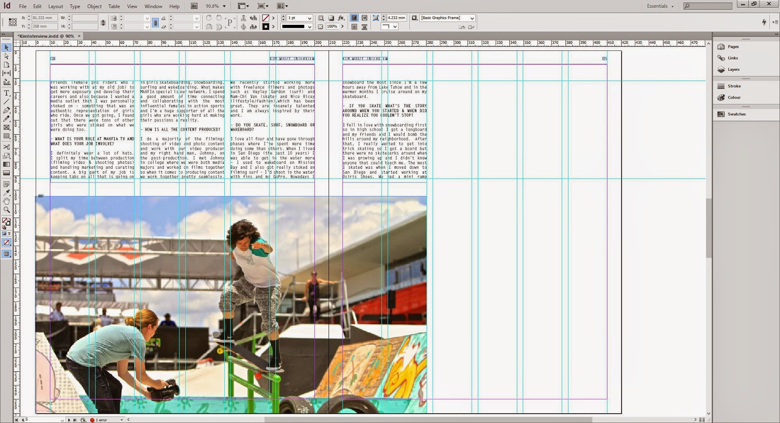
| Once the dimensions for the images were available the photographs were scaled in Photoshop to ensure no image pixelation occurred. |
 |
| Questions were rendered in the bold version of Letter Gothic and slightly spaced from the answer to help readers distinguish between the two and help achieve optimum readability. |
 |
| Extracted text was rendered in red to distinguish it from the bodycopy and add vibrance to the page. |
 |
| The image of Lizzie Armanto had to be cropped to the bounding box as the dimensions of the original image would not work with the desired composition. |
 |
| Again, the picture of Kim was a tough one to work with as the image did not want to fit the desired bounding box. Therefore, much alike the image of Lizzie the photograph was scaled to the height of the box with the width being cropped to make it fit. |
FINAL SPREADS
Images of the final spreads can be seen below;
Monday, 2 March 2015
PPP3 - WORK IN SKATEBOARDING - SUBMISSION
Once I had finished the process of composing the publication and thoroughly reviewing its contents to check for any potential mistakes I felt confident enough to send the file through to Sam.
As requested, the mock-up publication was exported as an interactive PDF, allowing Sam to view the piece online and upload it onto digital publishing websites.
The response was nothing but positive and confirmed that I had skills adequate enough to secure me a place on the programme starting at the end of May.


SUBMISSION UPDATE
So today, over a month after I submitted my 'mock-up' editorial layout I received a message from Sam informing me that there was a slight update that needs making to the publication. Furthermore, I was also informed that Sam wants to post the outcome online this week, to coincide with the launch of Mahfia's new website.
I was unaware that the layout would be used as initially I was told that it was a task to see if I was good enough to take part in the programme. However, it was a nice surprise and indicates that she was really impressed with my response. Anyway, the small change was made and the publication was resubmitted ready for publishing later in the week.


Tuesday, 24 February 2015
PPP3 - WORK IN SKATEBOARDING - DESIGN DECISIONS
Once I had collected a quick body of research reviewing a selection of leading industry skateboard and surf publications I progressed with the project and started to define the individual elements that will help to build a strong, consistent aesthetic for the publication.
The content and dimensions for the publication is already predetermined however, I have creative influence over the areas listed below;
COLOUR SCHEME
Similarly to the colour schemes utilised in Surf magazine, which was reviewed as part of my research, I decided to go with a simple colour scheme consisting of two main hues, black and red.
The colour red was chosen due to the psychological associations it has, which describe it as an energising colour that represents a pioneering spirit and leadership qualitiesm therefore making it a perfect representation for Kim, who is breaking boundaries with her all girls extreme sports media channel.
The colours form a nice visual balance that is not too distracting from the publications content, leaving me free to experiment with applying the red to highlight specific aspects of the article and render the visual elements.

TYPEFACES
Choosing the typefaces was relatively straight forwards as I already had in mind the style of typefaces I wanted to use and combine.
HEADING
The primary typeface, which will be used for all of the headings and text excerpts, is Biko Bold, a simple, striking sans-serif typeface that will grab the audiences attention and form a clear hierarchy with the body copy.

BODYCOPY
For the body copy, I decided to use a monospaced font called Letter Gothic Std, which is a clean sans-serif font that retains legibility at small sizes, making it the perfect choice for publication body-copy.

MIXING & HIERARCHY
After choosing the two fonts I decided to make a quick mock-up layout to ensure the fonts mixed cohesively on the page and formed a clear typographic hierarchy.

VISUAL ELEMENTS
Finally, after defining the colour scheme and range of typefaces I made a selection of simple illustrated visual elements that can be added to parts of the publication to help make it more aesthetically engaging.
The choice to add the visual elements to certain parts of the publication was inspired by the magazines reviewed as part of my research, which commonly used similar techniques to improve the visual quality of their pages.
The simple illustrations created were all inspired by the various extreme sports Kim Woozy's company Mahfia focuses on documenting and publicising, such as skateboarding, surfing and snowboarding.

The content and dimensions for the publication is already predetermined however, I have creative influence over the areas listed below;
- Colour scheme.
- Typefaces.
- Primary.
- Secondary.
- Visual elements.
COLOUR SCHEME
Similarly to the colour schemes utilised in Surf magazine, which was reviewed as part of my research, I decided to go with a simple colour scheme consisting of two main hues, black and red.
The colour red was chosen due to the psychological associations it has, which describe it as an energising colour that represents a pioneering spirit and leadership qualitiesm therefore making it a perfect representation for Kim, who is breaking boundaries with her all girls extreme sports media channel.
The colours form a nice visual balance that is not too distracting from the publications content, leaving me free to experiment with applying the red to highlight specific aspects of the article and render the visual elements.
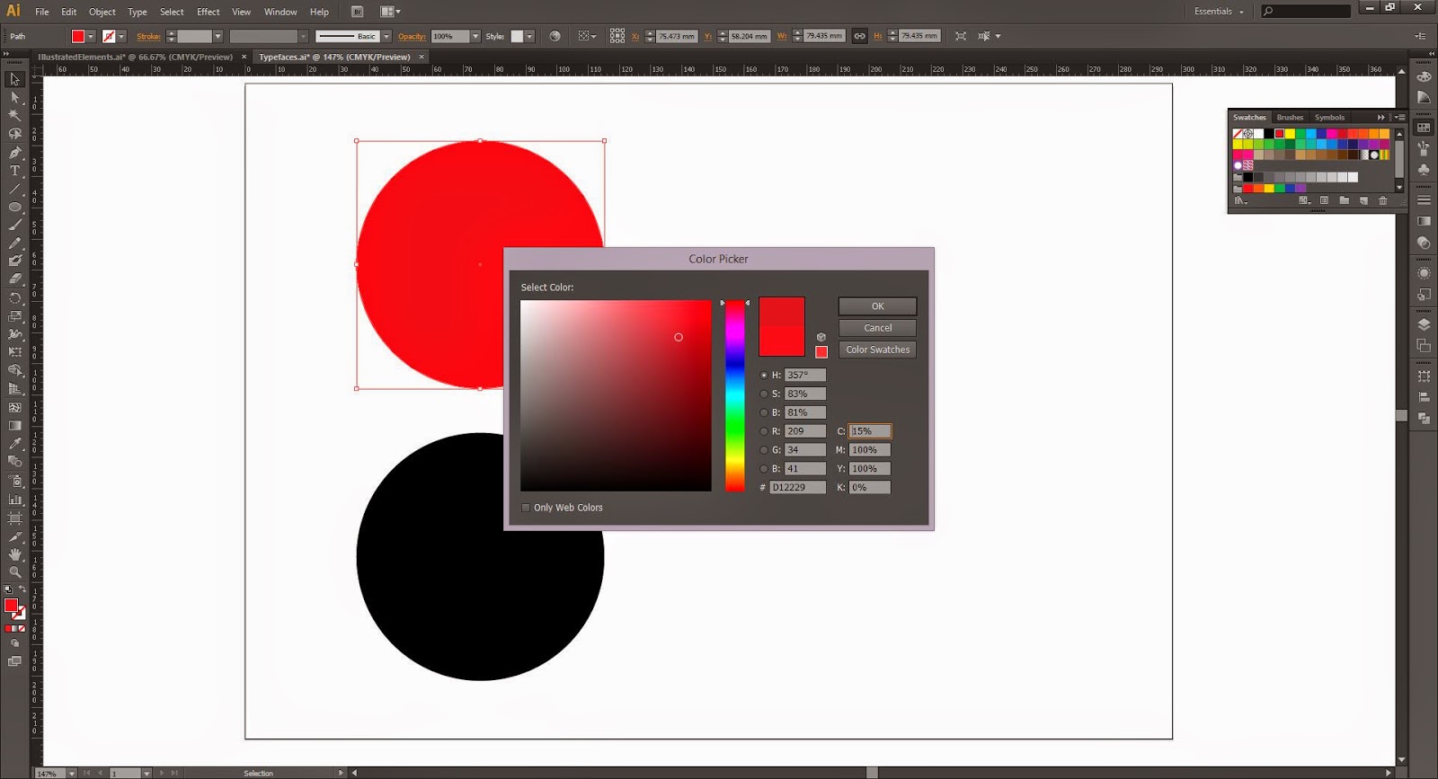 |
| Initially, I went for a pure red hue, however, upon closer inspection I realised that it was more vibrant than I wanted it. To solve the problem I simply added some cyan into the mix which darkened the colour and made it less garish. |
TYPEFACES
Choosing the typefaces was relatively straight forwards as I already had in mind the style of typefaces I wanted to use and combine.
HEADING
The primary typeface, which will be used for all of the headings and text excerpts, is Biko Bold, a simple, striking sans-serif typeface that will grab the audiences attention and form a clear hierarchy with the body copy.
BODYCOPY
For the body copy, I decided to use a monospaced font called Letter Gothic Std, which is a clean sans-serif font that retains legibility at small sizes, making it the perfect choice for publication body-copy.
MIXING & HIERARCHY
After choosing the two fonts I decided to make a quick mock-up layout to ensure the fonts mixed cohesively on the page and formed a clear typographic hierarchy.
VISUAL ELEMENTS
Finally, after defining the colour scheme and range of typefaces I made a selection of simple illustrated visual elements that can be added to parts of the publication to help make it more aesthetically engaging.
The choice to add the visual elements to certain parts of the publication was inspired by the magazines reviewed as part of my research, which commonly used similar techniques to improve the visual quality of their pages.
The simple illustrations created were all inspired by the various extreme sports Kim Woozy's company Mahfia focuses on documenting and publicising, such as skateboarding, surfing and snowboarding.
PPP3 - WORK IN SKATEBOARDING - MAGAZINE RESEARCH
After receiving the specifications for the 'Work in Skateboarding' editorial project I immediately progressed with the brief by collecting a body of secondary research into some of the leading surf, skate and lifestyle magazines currently in circulation.
As discussed on the previous post, the project as a short timescale and needs to be completed quickly, leaving me without the time to collect primary research into the aesthetic preferences of the target audience. To surpass the problem I have decided to review and analyse some of the leading industry publications to see what aesthetic elements I can take, reinvent and integrate into the design of my outcome.
TRANSWORLD SURF REDESIGN - WEDGE & LEVER
Images below document the Transworld Surf Magazine redesign project which was completed by Wedge & Lever.
After a period of dwindling sales Wedge and Lever were employed to revitalise the magazines aesthetic, aiming to achieve a cohesive brand that is sophisticated yet doesn't take itself too seriously.


IMPORTANT POINTS -
HUCK MAGAZINE - SHE WAS ONLY
HUCK is a global magazine exploring the many facets of radical culture, be it surf, skate, snow, music, art, activism, pop culture, the environment and the world.


IMPORTANT POINTS -
HUCK MAGAZINE - SHE WAS ONLY


As discussed on the previous post, the project as a short timescale and needs to be completed quickly, leaving me without the time to collect primary research into the aesthetic preferences of the target audience. To surpass the problem I have decided to review and analyse some of the leading industry publications to see what aesthetic elements I can take, reinvent and integrate into the design of my outcome.
TRANSWORLD SURF REDESIGN - WEDGE & LEVER
Images below document the Transworld Surf Magazine redesign project which was completed by Wedge & Lever.
After a period of dwindling sales Wedge and Lever were employed to revitalise the magazines aesthetic, aiming to achieve a cohesive brand that is sophisticated yet doesn't take itself too seriously.
IMPORTANT POINTS -
- Cover makes use of a bold, attention grabbing sans-serif logo that has a fixed placement across all covers.
- A simple colour scheme, consisting of never more than two colours is used for content such as then logo and cover information.
- The neural stock colours used for the cover of the publication are subtle and don't take away focus from the content.
- Page layouts are simple and effectively display information.
- The grids used to compose the content also make use of a varying column width which helps to break up content.
HUCK MAGAZINE - SHE WAS ONLY
HUCK is a global magazine exploring the many facets of radical culture, be it surf, skate, snow, music, art, activism, pop culture, the environment and the world.
- Huck magazine also makes use of a bold, attention grabbing logo type.
- Negative space is effectively used and creates space for aesthetic elements such as the hand written type which undoubtedly has relevance to the magazines content.
- The layouts used in this edition are more experimental that those used within Surf Magazine, making used of negative space and overlapping with images.
- Photographs are composed in a random looking fashion with some images even running off the page - although the layouts look random the images help to guide the readers eye around the pages content.
HUCK MAGAZINE - SHE WAS ONLY
Link
IMPORTANT POINTS -
- Huck's logo also retains a fixed position across all its covers.
- The layouts used for images and content in this issue are slightly less experimental and take on a much more aligned, formal look.
- A clear typographic hierarchy helps readers to identify specific parts of an article while simultaneously helping to guide the reader through the article.
GREY SKATEBOARD MAGAZINE
Grey Skateboard Magazine is a London based skateboard publication distributed freely around the UK.
Grey Skateboard Magazine is a London based skateboard publication distributed freely around the UK.
IMPORTANT POINTS -
- Same simple layout used consistently for content throughout the publication.
- Due to the publications small size images are usually larger than a single page.
- A clear typographic hierarchy helps readers to identify specific parts of an article while simultaneously helping to guide the reader through the article.
Subscribe to:
Posts (Atom)