Showing posts with label OUGD403. Show all posts

Saturday, 17 November 2012

MESSAGE AND DELIVERY - DISTRIBUTION CRIT


 Today, we had our critique for OUGD403 Message & Delivery – Distribution. I found this critique very helpful as it gave me required actions that I needed to complete to finish my project. Below are the feedback sheets.


The most important points that were made concerning my projects progression regarded producing my mailshot and adjusting my envelope dimensions. Up till this point in the project I had been focusing on the production of my poster and envelope. The envelope and poster hold the most importance need to be finished in time to be sent in the post. Moreover, they will form the content of the mail shot, therefore need to be produced to a high standard of visual quality.

It was also noted that my envelope dimensions were slightly off, when I researched into why this was I discovered that there was a slight re-sizing of the when sending to print. I overcame this by adjusting the print settings so this did not happen.

Friday, 9 November 2012

MESSAGE & DELIVERY - RESEARCH FINAL CRIT


Today, we had the final evaluation of the OUGD403 Message & Delivery – Research brief. This was conducted anonymously so that the feedback was not biased in anyway. To begin with, the class was split into groups, the first which I was in left our work on a table and left the second group to critique it.

Upon returning, on top of our work pile we had three individual sheets with feedback about our project. These can be seen below.


To conclude, the feedback made it clear to me that my posters are straight to the point and communicate the message clearly. One thing that I could have improved was to make the image poster clearer, as when looked at singularly it dosen’t communicate the intended message immediately. I could have overcome this problem by including a symbolism of health such as a heart or cross.

Moreover, my posters met all restrictions set by the brief, such as the 2:1 size and two-colour restriction. It was noted that the colour scheme and flag background formed a strong theme that ran throughout the poster set.

Finally, a type mistake was spotted, something that I had not noticed throughout the production. In future I need to proof read my text and get a second person to double check it to avoid mistakes like this. 

Friday, 26 October 2012

MESSAGE & DELIVERY - RESEARCH CRIT


Today I had a group crit with Simon. We congregated around a table with our collected research. In turn, each person presented their visual research explaining key points and information about their chosen story.  

My research was conducted on Fidel Castro, the revolutionary Cuban leader. I had collected pictures that almost formed a timeline of his life. Starting with pictures of Castro in his University days, up until the photos he recently released to the press to prove his health.

The feedback I received was helpful and will help me refine my research. Firstly, it was mentioned that I should research into why there are rumours that he is dead, apparently it is not the first time that it has happened. Moreover, I also need to research into Castro’s relationship with the western world. Finally, towards the end of my research I looked at some propaganda used for Castro’s regime, I want to research further into the propaganda used by Castro and different forms that it takes.   

Friday, 12 October 2012

PROGRESS CRIT

ALPHABET SOUP - TASK 2 - CRIT FEEDBACK


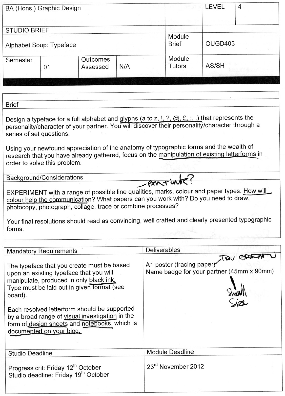
Today I presented my start on the second part of the alphabet soup brief. Task two asked us to make an alphabet that represented the personality or character of our partner. Below are things I learned from the crit.

Firstly, I only had ideas and research to present to the group, as I had not managed my time well enough to present physical mock ups of my alphabet. Due to this my work could not be criticised properly. I need to manage my time more appropriately and make sure i am not unprepared for the next crit.

Secondly, it was mentioned that my research was strong but I needed to start my experimentation earlier in the design process. 

Thursday, 11 October 2012

ALPHABET SOUP - TYPEFACE

Alphabet soup - Typeface


Firstly, the focus of this task was to produce an alphabet that portrayed my partner’s personality. In my research I noted down key points of Melissa’s personality, such as her favourite animal and hobbies. I wanted to combine illustration and collage to produce the letterforms as I believe this is best way of visually communicating Melissa’s personality. Below are the letterforms I produced.

(ADD ALL LETTERFORMS)

As a whole I think that the font achieves its purpose and portrays Melissa’s personality well. During the group crit (conducted on the day of our studio deadline) Melissa mentioned that the letterforms portray her character accurately, and all the main character traits such as her hobbies had been in included in the typeface. It was sometimes tough adapting objects to achieve a legible letterform, and still involve some aspect of her personality. However, I overcame this problem by looking at what it was that prevented the letter from working, then re-produced the letter amending the prior mistakes. I continued this until I had a letterform I was happy with. 

One of the mandatory requirements of the brief was that we produce an A1 sheet presenting our letterforms and glyphs. We traced our letterforms onto tracing paper and presented at our group crit, due to the nature of my letters this was a very lengthy process. Presenting my work in this way made me consider the sizing of my letterforms, fitting them on the sheet was not a problem as I produced my alphabet onto ten by ten squares. However, it did make me think about the sizing of my font. Would my letterforms still be legible at a small size? And what size would be best to present them?


I discovered the answer to the first question when making Melissa’s name badge. I scanned in the letters needed for her name and began to scale them to the right size, they were legible however, and some of the illustration detail was lost. When I was designing the letters I made a point of utilising a thick black outline, I believe this helped the legibility of the letters when scaled down. Moreover, I made the choice to produce my letterforms in uppercase. I chose uppercase because of how I produced my letters. As I was mixing illustration and collage it would be very difficult to create small rounded lowercase letters. 


Finally, in the crit it was mentioned that my letterforms where more of a display font rather than a typeface due to a mixture of unusual form and detail, so some functionality is lost. Moreover, as single letters the objects hold no meaning and therefore have no function. There are similarities between some letters but some words could look completely disjointed because of the range of graphic content.  I believe next time I will produce an alphabet that not only achieves its purpose but also works as a typeface and display font.