Friday 27 February 2015

DBA - PRESENTATION PRODUCTION

Today, while the rest of the group members put the finishing touches to their individual campaign elements I started producing the presentation that will be pitched to the DBA members as part of the 'Dragons Den' style final critique. 

To ensure that the presentation successfully introduces the brand identity and supporting campaign it is essential that it is structured in a way that tells the story of our Capital North proposal, this involves evidencing our inspirations, the various design decisions and the subsequent outcome.

Before creating the presentation I made a rough structure to help ensure all the relevant aspects are covered. 


PRESENTATION - ROUGH STRUCTURE 
  • Hello!
  • Introduce group members.
  • Brand attributes - how did they influence campaign?
  • Audience segmentation.
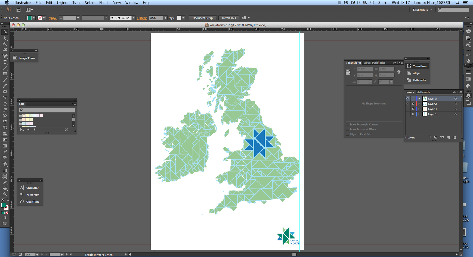
  • Logo & variations.
  • Identity aspects 
    • Colour scheme.
    • Typeface.
    • Visual elements.
  • Posters.
  • Train, taxi & bus livery.
  • Environmental applications. 
  • Additional applications.
    • Newspaper.  


SLIDES 

Once I had developed a rough structure for the presentation I opened illustrator and started creating the individual slides. To make sure the presentation is inline with the rest of the campaign the same colour scheme and typefaces used as part of the brand identity were applied to the presentation. 

The initial slides I created are displayed below;


While I was creating the presentation the other members of the group were finalising their contributions to the proposal. Once done, the final images and gif's of the work produced were given to me so I could integrate them into the presentation. 


SEAN

Sean was responsible for producing the posters and also created a moving gif and introductory logo for the presentation.


WORK PRODUCED -
  • 4x Posters.
  • Bus shelter digital advertisement gif.
  • Capital North introduction video.  

POSTERS 


JAMES

James was responsible for creating the design and digital mock-ups for the train, bus and taxi liveries. 


TRAIN LIVERY 


TAXI LIVERY 


BUS LIVERY 


JANE

Jane was responsible for creating the floor mural and physically producing the sculpture piece. 


FLOOR MURAL 


SCULPTURE


JAMIE'S WORK 

Finally, Jamie was responsible for creating the 'Capital North' newspaper publication with supporting digital and physical mock-ups. The digital mock-up will be displayed in the presentation with the physical version being used as a hand-out to review while we present. 


DIGITAL MOCK-UPS


PHYSICAL NEWSPAPER


PROGRESSION 

After all of the individually produced work had been completed and sent to me I progressed with my task by adding it into the presentation.

Unfortunately, I was unable to complete the presentation on Friday, so took all of the individual files home to complete it over the weekend. Once completed, the finished presentation was sent to my group members so they could look through and write notes for the sections they will present. 


PPP3 - ILLUSTRATION EXHIBITION - COLOURS MAY VARY

Today me and Leo walked down to the 'Colours May Vary' shop in Leeds to visit the LCA second year illustration exhibition. 

Unfortunately, we missed the opening night as we were working late in the studio in preparation for an impending deadline. Therefore, we decided to visit the show once we had the spare time available to do so. 


The work featured at the show was produced to a high quality, was interesting, original, and showcases the talented individuals the college helps to produce. Each student produced printed pieces for the show inspired by a book they read over the summer period away from university.

Some of my favorite pieces are displayed below;


PPP3 - PORTFOLIO REVIEW

Today I had my portfolio review with Andy Lodge during which I presented what I felt were the strongest projects I have produced during my time at university. 

As the COP3 module was only recently submitted I did not have a vast amount of third year work completed and photographed to talk through as part of the session, so instead reviewed a lot of my strongest work produced during the first two years on the course. 


PORTFOLIO

As of yet, I do not yet have a printed portfolio as I am still uncertain as to what exactly I want to include in my printed graduate portfolio. Therefore, I had no physical design boards to take to the session and so relied on my Behance as a way to showcase and talk through projects.

The projects from Behance I talked through during the session are listed below;

  • Transition Newspaper - COP3.
  • Self Branding.
  • Boardpusher Skateboard Illustration.
  • Print Guide.
  • Kennedy Poster.
  • Secret7" Entry. 


BEHANCE PROJECTS 

Projects were shown from my Behance that I felt were both conceptually and visually strong while simultaneously defining the focuses of my design practice. 

Behance Profile. 

COP3 - Transition Newspaper.
Personal Branding. 
Personal Branding. 

Board Pusher - Competition Entry. 
A guide to print.


ADDITIONAL PROJECTS 

As well as showing a range of my published projects to Andy I also decided to show him images from some more third year projects that have not yet been published on my Behance. 

Images were shown from three main projects; Natura, DSM and Secret7". 

Natura - Brand identity. 


Next, I showed images of my illustrative Secret7" submissions that had only recently been completed and submitted as part of this years competition. 

Secret7" Submission (Chemical Brothers - Let Forever Be)
Secret7" Submission (Born Slippy - Underworld)


After speaking through the selection of projects and discussing my current ideas surrounding my postgraduate progression from university Andy gave me a range of useful feedback on my current portfolio.


The points Andy made are listed below.  

FEEDBACK;

  • Very strong portfolio of work.
  • Work is clearly relevant to my practice and progression from university. 
  • Really enjoyed looking through the physical version of the newspaper - Consider taking physical elements to job interviews.  
  • Consider extending DSM 'Words of Wisdom' project to include shots of branding applied to an interior - Photographed or mock-up. 
  • Images of projects are really strong - no need to reshoot.
  • Create a physical and digital portfolio. 


PROGRESSION 

Overall, I found the session really useful as it allowed me to assess my current range of projects and define the ones that I feel best represent the focuses and quality of my practice. Furthermore, subsequently explaining the project concepts and supporting design decisions helped me to further assess the relevance of each of the individual projects I presented. 

To help me advance from the session I made a list of progression points that were created using the feedback received from Andy. 


PROGRESSION POINTS;
  • Create a printed physical portfolio.
  • Create a digital portfolio.
  • Extend DSM project.
  • Create a personal website. 

Wednesday 25 February 2015

PPP3 - INSPIRATION

Tonight while I was at the skate park, just as the sun was setting there was some truly beautiful tones and natural gradients in the sky. 

The colours and gradients produced by nature, specifically at the times of sunrise and sunset, in my opinion, are some of the most majestic and beautiful colours the human eyes can perceive.  


DBA - ANIMATED GIF

At the end of the previous progress criticism i was set the tasks of developing my unfinished poster concept into a moving gif.


ILLUSTRATION

Triangles were taken from the logo icon, scaled and then arranged to replicate the shape of the united kingdom. The process was very tedious and took a lot longer than I first imagined. 

The process of gif. development is displayed below;


The colours outlined during the last session were then applied to the arrangement of triangles.  


Finally, to finish the illustration a light creme background was added. 


Final illustration.


MOCK-UP

To ensure that the gif. is presented professionally I downloaded a bus stop mock up from which the gif. will be created.

As part of the free download three individual mock-ups were included which also featured day and night variations. Of the selection available, I felt the frontal facing display unit will be the most effective way of displaying the gif as it is placed centrally and not affected by perspective. 


GIF 

When creating the gif I had to upload the individual frames to the mock-up and then save the arrangement as a jpeg. so that the images can be used to create the gif.