
The content and dimensions for the publication is already predetermined however, I have creative influence over the areas listed below;
- Colour scheme.
- Typefaces.
- Primary.
- Secondary.
- Visual elements.
COLOUR SCHEME
Similarly to the colour schemes utilised in Surf magazine, which was reviewed as part of my research, I decided to go with a simple colour scheme consisting of two main hues, black and red.
The colour red was chosen due to the psychological associations it has, which describe it as an energising colour that represents a pioneering spirit and leadership qualitiesm therefore making it a perfect representation for Kim, who is breaking boundaries with her all girls extreme sports media channel.
The colours form a nice visual balance that is not too distracting from the publications content, leaving me free to experiment with applying the red to highlight specific aspects of the article and render the visual elements.
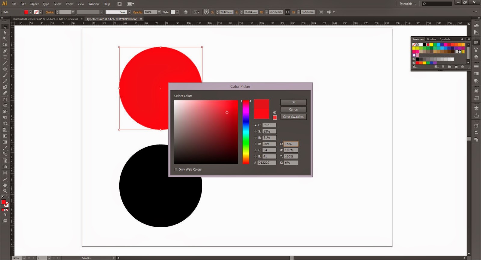 |
| Initially, I went for a pure red hue, however, upon closer inspection I realised that it was more vibrant than I wanted it. To solve the problem I simply added some cyan into the mix which darkened the colour and made it less garish. |

TYPEFACES
Choosing the typefaces was relatively straight forwards as I already had in mind the style of typefaces I wanted to use and combine.
HEADING
The primary typeface, which will be used for all of the headings and text excerpts, is Biko Bold, a simple, striking sans-serif typeface that will grab the audiences attention and form a clear hierarchy with the body copy.

BODYCOPY
For the body copy, I decided to use a monospaced font called Letter Gothic Std, which is a clean sans-serif font that retains legibility at small sizes, making it the perfect choice for publication body-copy.

MIXING & HIERARCHY
After choosing the two fonts I decided to make a quick mock-up layout to ensure the fonts mixed cohesively on the page and formed a clear typographic hierarchy.

VISUAL ELEMENTS
Finally, after defining the colour scheme and range of typefaces I made a selection of simple illustrated visual elements that can be added to parts of the publication to help make it more aesthetically engaging.
The choice to add the visual elements to certain parts of the publication was inspired by the magazines reviewed as part of my research, which commonly used similar techniques to improve the visual quality of their pages.
The simple illustrations created were all inspired by the various extreme sports Kim Woozy's company Mahfia focuses on documenting and publicising, such as skateboarding, surfing and snowboarding.

No comments:
Post a Comment