
LAYOUTS
The design process was started by first developing a range of thumbnail layouts exploring potential page compositions for the article.
As the outcome is being designed for a digital platform and will not be printed I have a lot more freedom with the number of pages that can be used. Instead of having to work within the limitations of a publication designed for print, where the number of pages have to be an equal number and above eight pages, a digital publication can essentially have any number of pages.
Despite this freedom, I want my outcome to have a front and back page and read like a printed outcome. Therefore, the number of pages will still have to end with an equal number but will not be restricted to achieving a minimum of eight pages.
The images below document the range of thumbnail layouts developed;


CHOSEN LAYOUTS
From the initial range of thumbnail layouts I chose final layouts for three double page spreads and two single pages, which will be used for the front and back of the outcome.
As the thumbnail layouts were used as a rough starting point, a lot of the layouts were refined and slightly adjusted during the process of choosing the set of final layouts.
PRODUCTION
Once I had developed a range of layouts and defined the ones which I think will work best with the amount of content that I have I was able to bring together all of the individual project elements and content and progress with the digitally developing the editorial layout.
Once I had developed a range of layouts and defined the ones which I think will work best with the amount of content that I have I was able to bring together all of the individual project elements and content and progress with the digitally developing the editorial layout.

 |
| A simple 6x7 grid was used to help me compose the cover of the publication. |
 |
| The publication title and supporting 'Work In Skateboarding' icon were both developed in Illustrator before being transferred into the Indesign document. |

 |
| The cover was completed with the addition of a visual element in the bottom left hand corner of the page. |

 |
| Once the dimensions for the images were available the photographs were scaled in Photoshop to ensure no image pixelation occurred. |


 |
| Questions were rendered in the bold version of Letter Gothic and slightly spaced from the answer to help readers distinguish between the two and help achieve optimum readability. |


 |
| Extracted text was rendered in red to distinguish it from the bodycopy and add vibrance to the page. |

 |
| The image of Lizzie Armanto had to be cropped to the bounding box as the dimensions of the original image would not work with the desired composition. |

 |
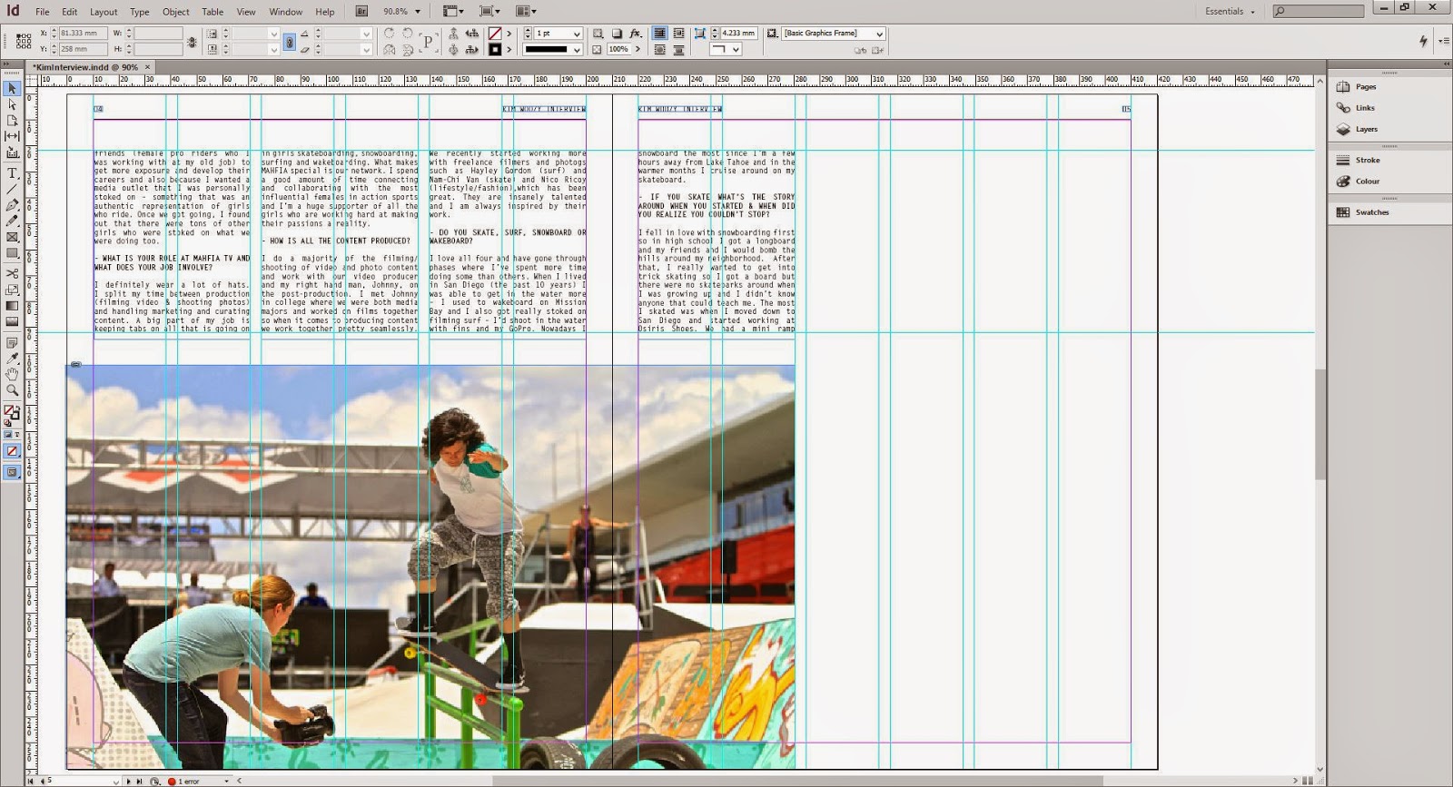
| Again, the picture of Kim was a tough one to work with as the image did not want to fit the desired bounding box. Therefore, much alike the image of Lizzie the photograph was scaled to the height of the box with the width being cropped to make it fit. |
FINAL SPREADS
Images of the final spreads can be seen below;


No comments:
Post a Comment